
Preview image. Unlock full-res
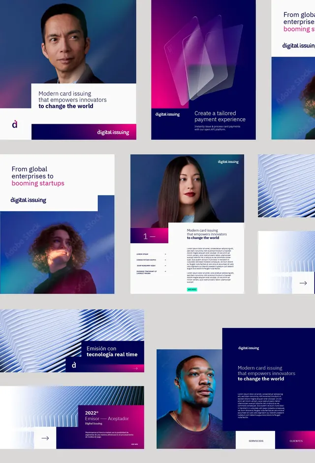
Professional services brand identity across four vertical panels using portrait photography, dark blue and teal palette, and geometric pattern systems.
Summary
Professional services brand identity across four vertical panels showing portraits and abstract geometry, with dark blue-teal palette and consistent type orientation.
Visual description
Four vertical panels presented side by side on black background. Panel one: man in gray blazer and light blue dress shirt holding tablet, photographed in modern office with blurred colleagues behind him; dark teal overlay on lower half with white sans-serif copy and repeating white vertical dashed lines. Panel two: woman wearing olive and cream striped apron and brown necklace, warm natural light, photographed from chest up. Panel three: vertical "deep" brand name in light blue on solid dark blue background with white website and contact details text. Panel four: dark background with radiating geometric pattern of light blue dashed lines fanning outward from center, containing white body copy and "deep" brand mark. Consistent use of dark navy-teal backgrounds, light blue and white text, and geometric line patterns throughout.
Key takeaway
Using professional portrait photography as a core brand element, paired with strict dark background color blocking to create consistency without looking corporate. The repeating geometric pattern systems (vertical dashes and radiating lines) add visual interest without competing with type. Vertical text orientation in panel three creates a strong typographic moment while maintaining readability. The interplay between warm human portraiture and cool blue-teal geometry signals both approachable professionalism and technical expertise.
Reuse notes
Strong approach for B2B professional services, accounting, or fintech where building human trust is critical. Works best when combined with documentary-style portrait photography rather than stock photography. The dark background palette works well on digital platforms and prints. Pattern systems (dashes and radiating lines) scale well from business cards to large format. Best paired with generous white space and one clear sans-serif family to avoid visual clutter.
More like this





Keep what you find
A free account saves references to boards and can send you a weekly email of picks based on what you save.
To see every result, go Pro.