Preview image. Unlock full-res
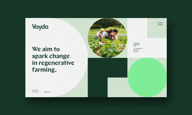
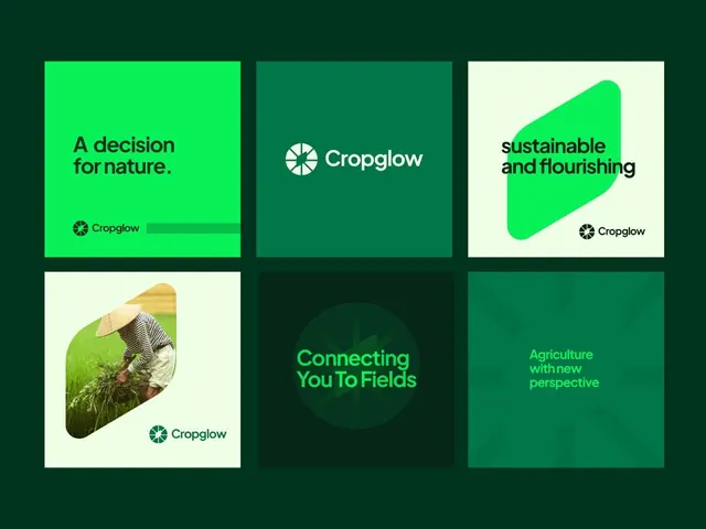
Sustainability-focused brand identity using soft greens and geometric abstraction to communicate environmental mission in farming.
Summary
Brand identity system for Vayda, an environmental organization promoting regenerative farming, combining soft sage and forest-green tones with bold geometric shapes and photographic imagery of farmland and crops.
Visual description
Two horizontal panels over a dark forest-green background. Left panel is off-white with the word "Vayda" in clean sans-serif at top, followed by the mission statement "We aim to spark change in regenerative farming" in bold, large type. Below sits a circular photograph of hands holding soil and plants. Right panel divides into abstract geometric forms: a circular photograph of flowering crops at upper right, and two overlapping color blocks (forest green rectangle and bright mint-green circle) at lower right. Minimal supporting text and icons are right-aligned on the far right edge. Clean, modern sans-serif typeface throughout in dark gray and white.
Key takeaway
The color palette (deep forest green + pale mint + white) conveys environmental trust without feeling heavy. Using large circular crops of photographic content surrounded by negative space and geometric abstraction creates visual lightness while keeping the mission-critical imagery prominent. The two-panel horizontal layout allows for flexible application across collateral.
Reuse notes
Well-suited for nonprofit and sustainability brands, environmental campaigns, or corporate ESG initiatives. The soft green palette reads authentic rather than trendy. Works especially well when the audience needs to feel calm and hopeful rather than urgent.
More like this






Keep what you find
A free account saves references to boards and can send you a weekly email of picks based on what you save.
To see every result, go Pro.