Preview image. Unlock full-res
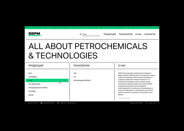
A high-contrast corporate website layout for an industrial company, featuring a teal header bar, black sans-serif headline, and a grid of categorized navigation links.
Summary
A B2B industrial website layout for a petrochemical company, featuring a teal header band, large black all-caps headline, and a three-column grid of categorized product and service links with light-gray accents.
Visual description
A website mockup on a black background showing the upper portion of a corporate layout. A teal horizontal band spans the full width near the top, containing navigation items in gray text. Below sits a large all-caps headline in bold black sans-serif ("ALL ABOUT PETROCHEMICALS & TECHNOLOGIES"). A light gray dividing line separates the header from the main content area. The main body uses a clean three-column grid: the leftmost column lists product categories in black text with a teal highlight on one active item; the center column headers category names in teal and lists subcategories; the right column presents a longer body of text, likely product descriptions. The entire composition is built on precise horizontal and vertical alignment, with ample white space and a strictly limited palette of black, white, teal, and gray. The typeface is a clean sans-serif, all caps for headlines, sentence case for body.
Key takeaway
The strategic use of a single teal accent to direct attention and establish visual hierarchy on an otherwise monochromatic grid. The three-column layout with aligned headers creates an organized, scannable interface suitable for information-dense industrial content. Generous white space and consistent line weight throughout convey professionalism and technical expertise without fussiness.
Reuse notes
Perfect reference for B2B manufacturing, chemical, energy, or logistics websites targeting serious, long-sales-cycle industries. The high contrast and clear hierarchy work well for users needing to navigate large product or service catalogs quickly. The restraint of the color palette ensures accessibility and readability across print and screen media.
More like this

Keep what you find
A free account saves references to boards and can send you a weekly email of picks based on what you save.
To see every result, go Pro.