Preview image. Unlock full-res
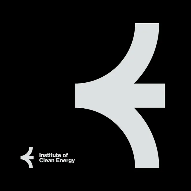
Minimal monochrome logo mark combining curved and straight lines to suggest forward motion, paired with sans-serif organization name on black.
Summary
Monochromatic geometric symbol using curved and straight paths to form a stylized arrow or energy glyph, positioned above a small wordmark, on pure black.
Visual description
Pure black background. Center-right: a light-gray abstract form built from two intersecting curved and linear shapes that suggest directional momentum or convergence. The mark has organic curves on the upper arc and angular verticals below, creating visual tension and a sense of forward thrust. Bottom left: small paired marks (a secondary glyph or accent), then sans-serif wordmark "Institute of Clean Energy" in bright white. Generous negative space; no extraneous detail.
Key takeaway
The way a single high-contrast geometric form can convey motion and purpose without literal imagery; the pairing of a large symbolic mark with minimal supporting type; the discipline of monochrome allowing the shape itself to carry all semantic weight.
Reuse notes
Ideal for nonprofits, energy companies, tech platforms, and institutions seeking clean, modern credibility. The upward/forward arrow reads as progress and sustainability. Works well at any scale, on black or light backgrounds. Pairs naturally with contemporary sans-serif typefaces. The simplicity makes it memorable and logo-adaptable.
More like this


Keep what you find
A free account saves references to boards and can send you a weekly email of picks based on what you save.
To see every result, go Pro.