Preview image. Unlock full-res
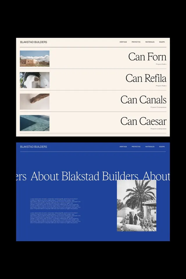
Portfolio website showcasing architectural projects with a dual-tone layout: cream section listing project names with thumbnail images, dark blue section with centered headline and lifestyle photograph.
Summary
Portfolio page layout pairing cream background with project name list and thumbnail images, followed by a navy section with large serif headline and architectural photograph.
Visual description
A two-section layout separated by color. Top section: cream background with horizontal navigation bar (Heritage, Proyectos, Materiales, Equipo) and the company name "Blakstad Builders" in sans-serif. Below, four horizontal rows each pair a small landscape photograph on the left (buildings, architectural details, water feature, pool) with a large serif right-aligned project name (Can Forn, Can Refila, Can Canals, Can Caesar) and project label below. Each row is separated by thin lines. Bottom section: deep navy background with overlaid serif headline "About Blakstad Builders" in white, accompanied by a black-and-white photograph of an architectural scene with a palm tree on the right side. Justified body text in light grey sits beneath the headline, left-aligned.
Key takeaway
The stark color contrast between sections creates visual momentum and hierarchy. The project-list pairing of small image plus large justified text is elegant and scales well. The serif display type against both light and dark backgrounds is strong and communicates craft.
Reuse notes
Effective for architecture, construction, or luxury real-estate portfolios. The cream-and-navy combination reads premium and works well for heritage brands. Reserve large images for genuine assets. Works best with strong serif typography and clean, tight spacing.
More like this





Keep what you find
A free account saves references to boards and can send you a weekly email of picks based on what you save.
To see every result, go Pro.