Preview image. Unlock full-res
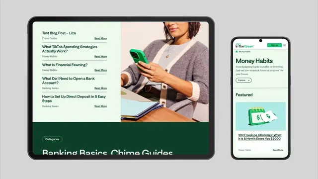
A two-device layout mockup pairing a tablet blog-list interface with a mobile app screen, unified by dark green branding, cream and light backgrounds, and financial education copy.
Summary
A side-by-side mockup showing tablet and phone interfaces for a fintech education app, with a dark green bar anchoring the composition, cream-background content list on the left, and a lighter mobile UI on the right.
Visual description
A scaled mockup scene with two devices on a light neutral background. The larger tablet (left) displays a cream-colored list of blog posts with titles like "What TikTok Spending Strategies Actually Work?" and "What Is Financial Fawning?" with category tags (Money Habits, Banking Basics, Chime Guides) and Read More links. A photograph of a woman with phone appears top-right of the tablet view. The tablet footer is dark forest green with visible "Banking Basics, Chime Guides" text. The smaller phone mockup (right) shows the app header with "inThe Green" branding, a light cream interior, "Money Habits" content card with an illustrated icon (green envelope/cash), and feature cards. Both devices use the same deep-green and light-cream color system with sans-serif body text and darker green headings.
Key takeaway
Two-device mockup stacked side-by-side shows responsive design thinking without needing separate screenshots. Dark green footer grounds the composition and establishes brand identity strongly. List-based content structure with clear hierarchy (category tags, links, typography weight change) makes complex information scannable. The green-and-cream palette reads trustworthy and approachable for financial education without feeling sterile.
Reuse notes
Suitable for fintech, educational tech, or financial literacy platforms targeting consumers. Works best with real photography and specific content titles (generic lorem ipsum weakens trust). The green branding is distinctive; ensure it matches brand guidelines if reusing.
More like this







Keep what you find
A free account saves references to boards and can send you a weekly email of picks based on what you save.
To see every result, go Pro.