Preview image. Unlock full-res
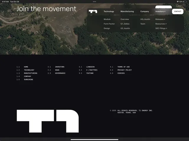
Dark-mode website hero overlaying an aerial forest photograph with white sans-serif headline, multi-column navigation menu, and a large white geometric logo at bottom.
Summary
A dark corporate website hero featuring a large-scale aerial forest photograph, white headline typography ("Join the movement"), a grid-based navigation menu with multi-column links, and a bold white geometric logo mark anchoring the lower portion.
Visual description
The hero section fills the viewport with a photographic background of dense green forest and winding paths viewed from above, creating depth and a sense of environmental scale. A dark semi-transparent overlay sits behind white sans-serif text positioned prominently in the upper portion. The headline uses oversized display type, set in all-caps or sentence case. Below the hero, a structured horizontal menu displays category links in a multi-column grid format (Technology, Manufacturing, Company, Investors) with nested second-level items (Module, Mobile, Form Factor, Design, etc.). A large geometric white logo mark occupies the lower half of the page, rendered in a bold, abstract shape. The entire composition uses black and white contrast against the muted earth tones of the photography, creating a cohesive, grounded aesthetic.
Key takeaway
The use of environmental photography as a thematic anchor that signals company values (sustainability, technology applied to nature) without explicit messaging. The geometric logo placed prominently but below the fold uses white space as a framing device. The hierarchical navigation grid allows dense information organization without clutter, keeping the focal point on the headline and image pairing.
Reuse notes
Strong for technology, energy, manufacturing, or sustainability-focused brands wanting to convey scale, ambition, and environmental responsibility. The dark palette with nature photography works particularly well for companies positioning themselves as forward-thinking or infrastructure-focused. The navigation structure suits information-heavy B2B sites where multiple product lines and stakeholder categories need equal prominence. The monochromatic color scheme keeps the design flexible across different industries while maintaining premium, professional presence.
More like this



Keep what you find
A free account saves references to boards and can send you a weekly email of picks based on what you save.
To see every result, go Pro.