Preview image. Unlock full-res
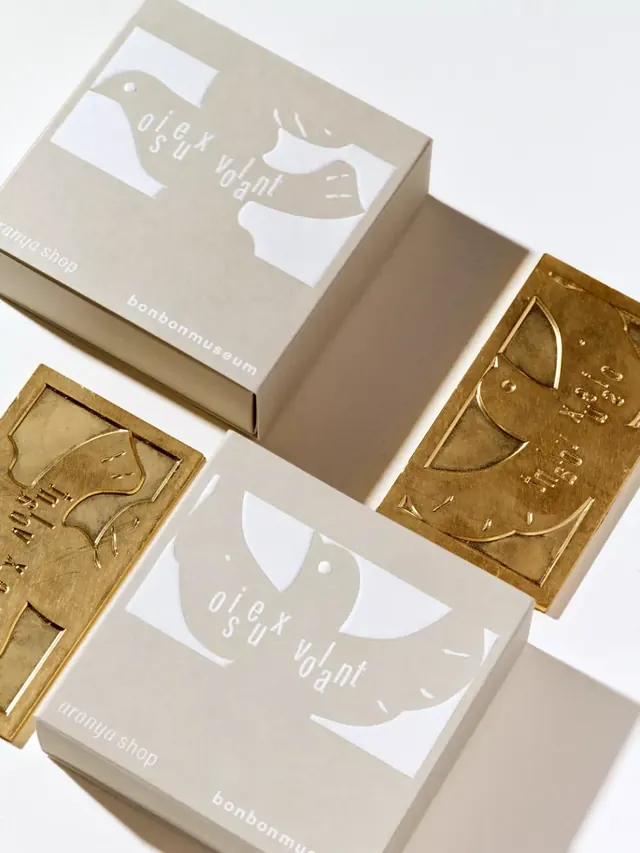
Luxury confectionery packaging in cream cardboard with minimalist white labels and hand-stamped brass embossed plaques, material contrast defines the design.
Summary
Luxury confectionery packaging combining cream kraft-paper boxes with white minimalist labels and hand-stamped brass embossed plaques, where material contrast becomes the primary design statement.
Visual description
Three kraft cardboard boxes in natural cream arranged in a flat-lay with two brass or gold-metal embossed plaques. Each box features a white rectangle housing a negative-space arc motif and white text reading "glt sun light" and "bonbonmuseum". The brass plaques show linear embossed line-art portraits aligned with the box aesthetic. Overhead lighting emphasizes surface texture: matte paper box sides versus reflective, warm-toned metal plaques, creating tactile visual interest. The composition overlaps diagonals to suggest the range of finishes within a single product family.
Key takeaway
The restraint in color and ornament: cream, white, and warm metal only. Using embossed brass as a second artifact rather than inline decoration keeps the primary packaging quiet and lets the material speak. The negative-space arc is the sole visual system, repeated across both mediums.
Reuse notes
Effective for high-end artisanal goods, museum retail, or gift packaging where material quality must shine. Works especially well when budget allows custom metal finishing. The two-material approach signals craftsmanship without ornament.
More like this
Keep what you find
A free account saves references to boards and can send you a weekly email of picks based on what you save.
To see every result, go Pro.