Preview image. Unlock full-res
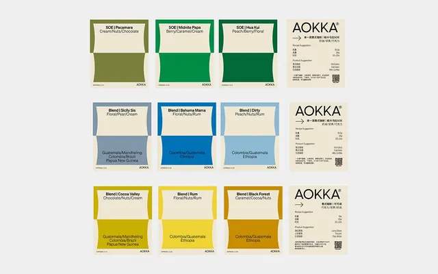
Nine specialty coffee package label designs arranged in a 3-by-3 grid, each with minimal typography and distinct color bands identifying single-origin and blended varieties.
Summary
Specialty coffee label system using minimal typography and a structured color palette to differentiate single-origin (SOE) and blended roasts, paired with consistent tasting-note descriptions and origin callouts.
Visual description
Gray background displaying a 3-by-3 grid of flat coffee package mockups. Each label occupies a rounded-rectangle white card with a solid colored band at the bottom identifying the roast variety. Top row uses olive green, dark forest green, and teal bands. Middle row uses slate blue, cobalt blue, and light powder blue. Bottom row uses yellow-gold, bright yellow, and burnt orange. Each label includes centered, san-serif typography: product name (SOE / Blend variant) on the header, flavor notes (e.g., "Cream/Nuts/Chocolate") at bottom-right of the white section, and geography/tasting notes (e.g., "Colombia/Brazil Papua New Guinea") in smaller type on the colored band. An Aokka wordmark logotype and Japanese text appear on every label. Right side of the composition shows three informational cards echoing the color coding, providing brewing instructions and nutrition facts in a clean, table format. The overall system emphasizes uniformity and legibility through tight grid structure, muted earth-tone palette, and hierarchical typography.
Key takeaway
Color-coding as a product taxonomy. Each hue instantly signals a roast family (green = SOE origins, blue = blends, gold = special preparation), allowing rapid visual scanning. Minimal typography (stripped to essentials: product name, notes, source) respects the card format and reads from shelf distance. The tasting-note structure (flavor / geographic origin) positions this as premium, educational coffee rather than commodity. The header/band layout maximizes label real estate while maintaining hierarchy.
Reuse notes
Ideal for specialty food, beverage, or artisanal goods where provenance and curation matter. The color system scales to accommodate many variants; maintain consistency by assigning hues to meaningful categories (single-origin, roast level, region, process) rather than arbitrary assignment. The pale, soft palette reads premium and natural; works well across print (kraft, matte finish) and digital. The Japanese text roots the brand in coffee tradition without requiring translation; use similar cultural signifiers sparingly for authenticity without exoticism.
More like this


Keep what you find
A free account saves references to boards and can send you a weekly email of picks based on what you save.
To see every result, go Pro.