Preview image. Unlock full-res
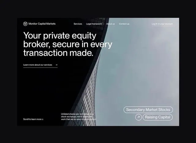
A dark, architectural fintech hero with split-screen layout: text and CTA on left, geometric building photograph and floating tag buttons on right.
Summary
A fintech hero layout splitting dark left panel (white headline and underline CTA) against a subtle blue-gray architectural photo with two floating pill-shaped tag buttons anchored lower right.
Visual description
Left third features a black background with a simple white logo at top, navigation menu (Services, Legal framework, About us, Contact us) in gray text, and a large headline in white sans-serif stating the value proposition. A single line of supporting text sits below, with an underlined text link ("Learn more about our services") acting as CTA. The right two-thirds shows an angled architectural photograph of a modern building interior with geometric grid lines, slightly desaturated with a cool blue-gray tone. Layered over the photograph in the lower right quadrant are two connected pill-shaped buttons with white text and outlined borders (Secondary Market Stocks, Raising Capital), suggesting topic tags or service categories. A small down-arrow and supporting text ("Scroll to learn more") indicates scrollable content below.
Key takeaway
The asymmetric hero layout creates breathing room while maintaining focus: copy and CTA occupy the smaller, active left third, allowing the photograph to dominate and set the tone without competing text. The pill-button treatment of secondary navigation (rather than traditional links) feels modern and tappable. Minimal color palette (black, white, subtle blue-gray) reinforces institutional trust; the underline on the CTA is a quiet but effective affordance that reads better at scale than a solid button.
Reuse notes
Ideal for fintech, wealth management, and professional services where trust and stability are paramount. The architectural photo reinforces institutional solidity; substitute with imagery that matches your vertical (data center, trading floor, legal office). Works best on desktop and wide viewports due to split-screen layout; consider collapsing to stacked on mobile. Avoid on bright or colorful backgrounds as the subtle palette will compete.
More like this

Keep what you find
A free account saves references to boards and can send you a weekly email of picks based on what you save.
To see every result, go Pro.