Preview image. Unlock full-res
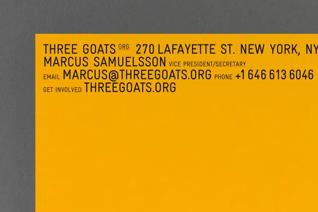
A high-contrast contact card for Three Goats Org using bright golden-yellow background and all-caps dark gray sans-serif typography to display name, role, email, phone, and website in a stacked, information-dense layout.
Summary
A contact card for Three Goats Org printed on a bright golden-yellow ground with dark gray all-caps sans-serif type stacked vertically to list organization name, officer role, email, phone, and web address.
Visual description
A solid golden-yellow rectangle dominates the composition, occupying roughly 60 percent of the frame. The remaining area shows gray concrete or textured surface as background. On the yellow field, dark charcoal-gray sans-serif type in all-caps is stacked vertically in a tight, information-heavy layout. From top: "THREE GOATS ORG." (largest, two lines), "270 LAFAYETTE ST. NEW YORK, NY" (address, smaller), "MARCUS SAMUELSSON VICE PRESIDENT/SECRETARY" (person and title), "EMAIL MARCUS@THREEGOATS.ORG PHONE +1 646 613 6046" (contact details, mixed line breaks), and "GET INVOLVED THREEGOATS.ORG" (call-to-action and website). No graphics, no imagery, no color variation. The power comes from the stark contrast and the typeface's weight and all-caps setting.
Key takeaway
Maximum information density in a single color field: use all-caps sans-serif to create perceived boldness without adding visual elements. The hierarchy emerges from line-weight and slight size variation, not from color or spacing shifts. Yellow as an attention-grabber for a nonprofit: accessible, energetic, hard to miss.
Reuse notes
Perfect for nonprofits, grassroots organizations, and causes that need clarity and directness over visual polish. Works best when contact details and a single URL are the entire message. High-contrast yellow and gray is legible in print, on web, and at small scale (business card, sticker). Avoid for luxury brands or services where restraint is the goal; the boldness reads as earnest rather than exclusive.
More like this






Keep what you find
A free account saves references to boards and can send you a weekly email of picks based on what you save.
To see every result, go Pro.