Preview image. Unlock full-res
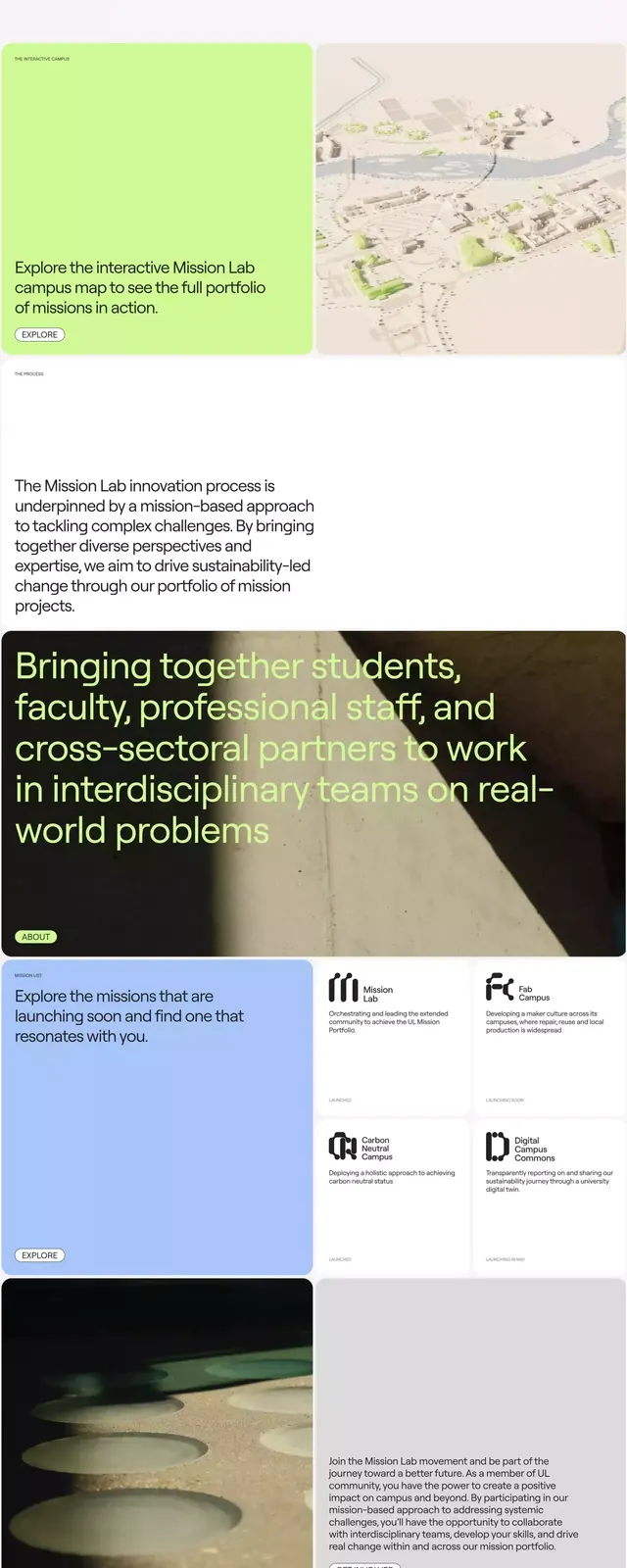
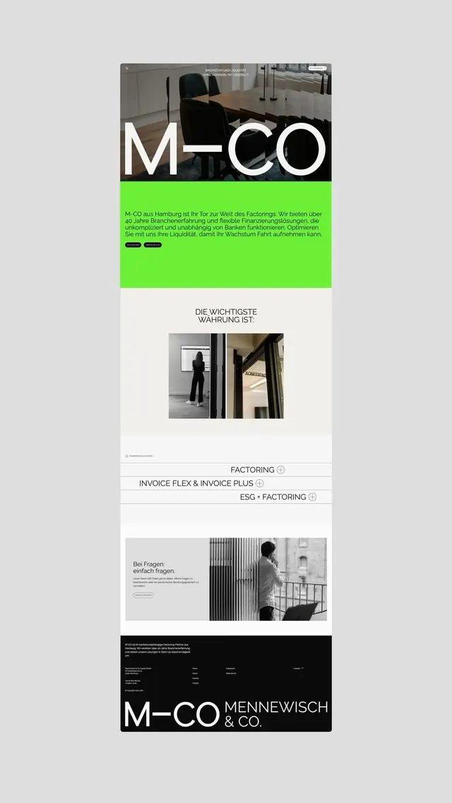
Vertical nonprofit website combining high-contrast type, lime-green and blue accents, and a structured grid of content blocks and icons.
Summary
Nonprofit website layout featuring stacked content sections with high-contrast black and white type, lime-green and blue accent colors, and a grid-based composition of text blocks and icons.
Visual description
Vertical layout structured in five distinct sections. Top section states mission ("Join a Mission Make a Change") in white caps against dark background. Second section introduces the organization with a subtitle and a pair of color cards: one in muted tan-beige on the left, one in soft green-yellow on the right, each with accompanying map or data visualization. Third section uses dark background with white sans-serif headline and copy, introducing the core idea. Fourth section arranges four labeled icons (shown as abstract letterform symbols: letters f, r, e, d) in a 2x2 grid against a light background, with blue and green color coding. Fifth section uses a white background with dark text and a tan accent block on the right containing additional copy.
Key takeaway
The color discipline: limiting to black, white, tan, lime-green, and sky-blue creates a cohesive academic feel without visual noise. The vertical stacking pattern with alternating color blocks creates clear visual rhythm and section breaks. The icon/symbol grid approach for introducing abstract concepts maintains minimalism while adding visual interest.
Reuse notes
Ideal for educational institutions, research labs, nonprofits, or b2b organizations communicating complex missions. The high contrast and generous white space ensure legibility at any size. The neon accents work best when the content is mission-driven and serious; the color palette signals trust and innovation. Avoid on image-heavy or illustrative sites.
More like this


Keep what you find
A free account saves references to boards and can send you a weekly email of picks based on what you save.
To see every result, go Pro.