Preview image. Unlock full-res
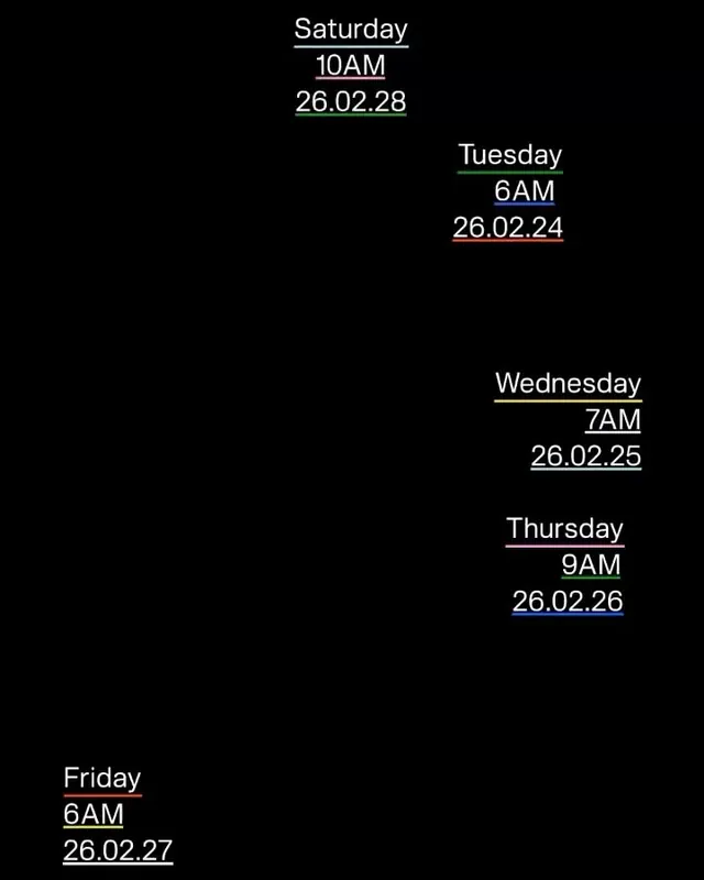
A minimalist event schedule displayed as floating text on black, with days stacked asymmetrically and green-underlined dates.
Summary
A minimalist event schedule displayed as floating text on black, with days stacked asymmetrically and green-underlined dates.
Visual description
Pure black background holds six day entries in white sans-serif type, positioned unevenly across the frame: Saturday, Tuesday, Wednesday, Thursday, Friday arranged in a loose diagonal scatter. Each entry shows the day name, time in all-caps (10AM, 6AM, 7AM, 9AM), and a green-underlined date (26.02.28, 26.02.24, etc.). The asymmetric placement creates visual movement without formal hierarchy, while the green accent lines provide the only color contrast. The composition reads like a digital event list or CLI interface.
Key takeaway
Green accent underlines on a monochrome black-white base read as urgent yet clean. Asymmetric text placement can convey dynamism in a functional context. The minimal color palette (pure black, white, single accent) focuses attention without decoration.
Reuse notes
Useful for event schedules, appointment displays, or any time-based information that needs a technical, no-nonsense feel. The monochrome approach works well when printed or displayed in constrained environments. Avoid using this style when date/time complexity is high, as the scattered placement would become confusing.
More like this



Keep what you find
A free account saves references to boards and can send you a weekly email of picks based on what you save.
To see every result, go Pro.