Preview image. Unlock full-res
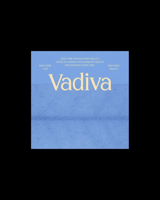
Wellness brand name in warm gold serif type centered over a soft blue gradient ground with surrounding descriptive text in sans-serif.
Summary
A luxury beauty brand identity centered around a serif wordmark "Vadiva" in soft gold over a cool blue gradient background with surrounding benefit copy in muted sans-serif.
Visual description
Composition is symmetrically centered on a medium blue gradient ground (lighter at top, darker toward bottom) with a subtle pearlescent or linen-like texture overlay. The brand name "Vadiva" appears in large, warm-toned serif type (pale gold or champagne) positioned in the lower half. Above it, four separate sans-serif text blocks in off-white sit at cardinal positions, reading "Body care for healthier beauty," "Vadiva is a brand that suggests healthy and enjoyable body care," and flanking labels "Body care for" and "Healthier beauty." The overall effect is serene, spa-like, with generous breathing room around all type. Dark ground visible at frame edges.
Key takeaway
The centered, multi-layered text hierarchy that balances a dominant serif mark with supporting benefit-copy surrounding it. The cool gradient ground paired with warm metallic type creates gentle luxury without ostentation. The use of multiple small sans-serif callouts to build brand story around a central mark.
Reuse notes
Ideal for prestige skincare, wellness, or cosmetics brands targeting calm, self-care positioning. The color pairing (soft blue + warm metallics) reads as serene and premium. Works well for packaging, social, and digital applications where space allows the centered, symmetrical composition.
More like this




Keep what you find
A free account saves references to boards and can send you a weekly email of picks based on what you save.
To see every result, go Pro.