Preview image. Unlock full-res
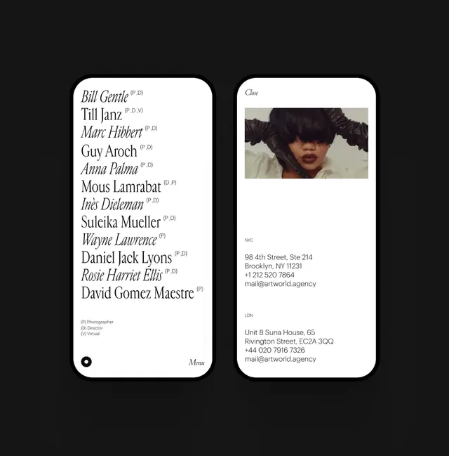
Two-column directory card with a name list on the left in serif type and contact details with a portrait on the right, set on a charcoal background.
Summary
A contact directory card split vertically: a list of names in serif type on the left, and contact details paired with a portrait photo on the right, separated by a subtle dot navigation marker.
Visual description
Dark charcoal background supports the entire composition. The left panel displays a vertical list of names in serif type, sized to emphasis and arranged for quick scanning, with smaller secondary text below each name. The right panel features a full-bleed portrait photograph of a woman set above a block of white contact information. Below the portrait, address details and email are rendered in sans-serif, occupying roughly half the height. At the card bottom, a small centered navigation dot marks the view state. The overall aesthetic uses only white, black, and gray; extreme whitespace and clean edges define the modernist grid.
Key takeaway
The serif/sans-serif pairing (serif for hierarchy, sans for contact data) clarifies the information hierarchy. The portrait-to-data ratio (large photo, compact address block) makes the person the primary focus. The monochrome palette and negative space convey professionalism without distraction.
Reuse notes
Ideal for portfolios, agency team pages, and professional directories. Works best when the portrait genuinely adds value; the large photo area demands good imagery. White/black/gray foundation pairs well with colored accent border or background wash if needed.
More like this




Keep what you find
A free account saves references to boards and can send you a weekly email of picks based on what you save.
To see every result, go Pro.