Preview image. Unlock full-res
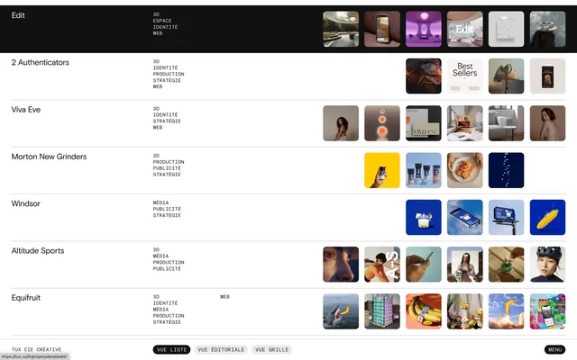
Dark-background portfolio directory listing companies in a left sidebar with thumbnail grid on the right, each company's work grouped in rows.
Summary
Directory interface showing a vertical sidebar list of company or brand names (2 Authentications, Viva Eve, Mention New Grinders, Windoor, Attitude Sports, Equifull) with each name linked to a horizontal row of case-study thumbnail images on a dark background.
Visual description
Dark background (near black) with a left-aligned narrow sidebar containing plain-text company names stacked vertically, each with small metadata tags (region, industry codes). The main content area displays 5-6 rows of thumbnail images in warm and cool tones—lifestyle photography, interiors, products—each row representing one company's portfolio. Thumbnails are roughly square or slightly rectangular, tightly spaced, and appear to link to deeper case-study pages. Small icon pairs (play button, link icon) appear near some text. The interface conveys a sleek, gallery-like curation aesthetic, relying on the photographs themselves for visual interest.
Key takeaway
The sidebar-plus-grid pattern efficiently organizes multiple portfolios in one view without overwhelming the eye. The muted color palette (cream, taupe, deep charcoal) lets the portfolio imagery (warmer, more saturated) pop without clashing. The use of company-name anchors as the primary navigation keeps the interface lean and hierarchical, reducing visual noise while maintaining discoverability of multiple entities.
Reuse notes
Ideal for agency directories, creative networks, or multi-brand portfolio platforms where showing many companies' work in one interface is the goal. Works especially well when the case-study imagery is strong and varied in tone (mixing warm and cool, lifestyle and product). Avoid for single-company portfolios or marketing sites; the grid-and-sidebar pattern implies choice and comparison. The dark background demands high contrast in the sidebar text—test readability before applying to colored or busy backgrounds.
More like this


Keep what you find
A free account saves references to boards and can send you a weekly email of picks based on what you save.
To see every result, go Pro.