Preview image. Unlock full-res
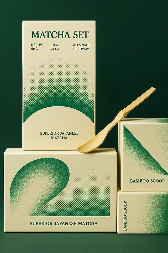
Luxury matcha packaging set using halftone texture transitions from cream to deep green, stacked boxes with elegant serif and sans-serif labeling.
Summary
A matcha product set using halftone-textured packaging that transitions from cream to deep forest green, paired with a brass-finished bamboo scoop and stacked presentation.
Visual description
Three kraft-style boxes (one tall box, two shorter) arranged in a staggered stack against a teal-green background. Each box features a dense halftone dot pattern that fades and intensifies to create gradient transitions from pale cream to dark teal-green. The tall box displays "MATCHA SET" in a condensed all-caps serif headline with weight information below; lower text reads "SUPERIOR JAPANESE MATCHA." A brass-colored bamboo scoop with a flat bowl sits prominently across the front left box. The right side shows cropped views of two additional boxes, with one labeled "BAMBOO SCOOP" vertically. Typography is mixed serif for headlines and sans-serif for detail copy, all in dark teal. The composition emphasizes the geometric box forms and the halftone texture as the primary visual device.
Key takeaway
The halftone gradient as a texture-based way to add depth without photography or illustration. The serif/sans-serif pairing for hierarchy (display serif for product name, clean sans for specs). The metallic scoop as a tactile accent that breaks the purely graphic plane.
Reuse notes
Effective for premium food, beverage, or wellness packaging. The halftone technique works especially well when the product itself has a natural, powder-like character. Pairs well with minimalist branding and earthy color stories. Avoid if the target palette is very saturated or bold.
More like this

Keep what you find
A free account saves references to boards and can send you a weekly email of picks based on what you save.
To see every result, go Pro.