Preview image. Unlock full-res
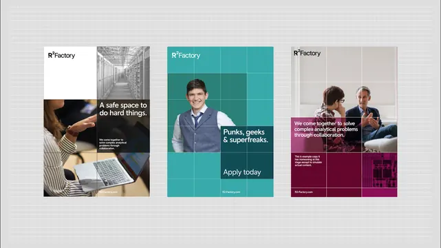
Three 2x2 grid panels for R²Factory recruiting, each combining photography, text, and a secondary color field to showcase company culture.
Summary
Three adjacent 2x2 grids recruiting for R²Factory, using teal, magenta, and neutral color blocking to present job openings, culture, and a call-to-action.
Visual description
Light gray background with subtle grid overlay. Three columns of 2x2 grid cards, evenly spaced. Left panel (teal-dominant): top-left has 50% photo of hands typing on laptop, top-right is white with headline "A safe space to do hard things" and body copy (small text, neutral gray). Bottom half is a darker teal field with small text. R²Factory logo (wordmark) in bottom-left corner. Center panel: top-left quadrant is light beige/white with R²Factory logo and text "R²Factory". Top-right is teal with a portrait photo of a smiling person wearing a navy blazer (shot headshot, cropped to shoulders). Center and bottom text reads "Punks, geeks & superfreaks" with "Apply today" button in teal below. Right panel (magenta-dominant): top-left is beige. Top-right is magenta/burgundy with a photo of two people collaborating at a desk. Bottom text in white reads "We come together to solve complex analytical problems through collaboration" with additional fine print and R²Factory logo. All text in clean sans-serif (likely sans-serif geometric family); minimal line weights, high contrast between teal and magenta sections. Photos are full-bleed within grid quadrants.
Key takeaway
2x2 grids create flexible containers for mixing photography, color fields, and copy without feeling cramped. Complementary teal-magenta contrast draws the eye across panels. Each panel tells a micro-story (culture, team type, mission) while maintaining visual unity through consistent grid spacing and type scale.
Reuse notes
Strong format for recruiting campaigns, company culture presentations, and multi-narrative case studies. The geometric grid and bold color fields work equally well as print posters, social media sequences, or web landing sections. Best for brands with strong color identity and quality photography; weaker photography would undermine the clean grid structure.
More like this




Keep what you find
A free account saves references to boards and can send you a weekly email of picks based on what you save.
To see every result, go Pro.