Preview image. Unlock full-res
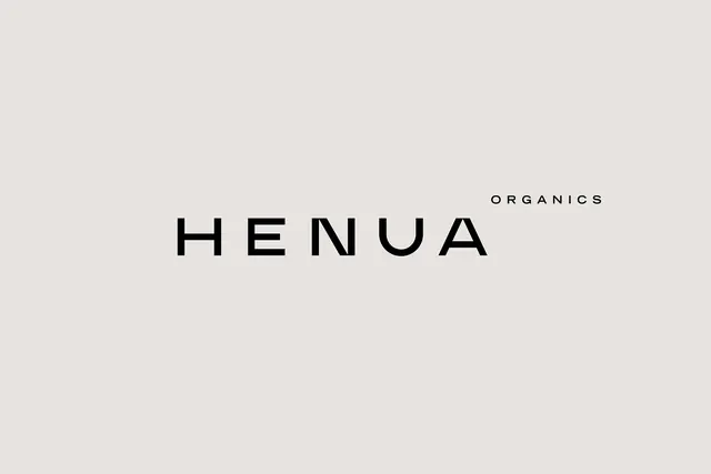
Monochrome wordmark for an organic brand: wide sans-serif caps spelling HENUA with a small ORGANICS label above, anchored by a minimal geometric sun icon.
Summary
Monochrome wordmark for an organic brand: wide sans-serif caps spelling HENUA with a small ORGANICS label above, anchored by a minimal geometric sun icon.
Visual description
Against a warm beige background, black letters spell HENUA in an extended, geometric sans-serif. Above the main wordmark, ORGANICS appears in a smaller, tight sans-serif in all caps. A circular geometric sun icon (filled circle divided into wedges) sits above the text, providing the only visual ornament. The overall effect is high-contrast, minimal, and print-friendly, with ample negative space around the mark.
Key takeaway
The hierarchy between primary wordmark (HENUA) and secondary label (ORGANICS), using scale and weight rather than color. The icon-text pairing where a simple geometric sun suggests organic/natural without becoming decorative clutter. The extended letterform width adds modern character while remaining highly legible.
Reuse notes
Ideal for organic, wellness, or health brands needing a clean, scalable mark that works across digital and print. The monochrome palette ensures the wordmark remains recognizable at any size or background. Pairs well with photography or natural textures.
More like this



Keep what you find
A free account saves references to boards and can send you a weekly email of picks based on what you save.
To see every result, go Pro.