Preview image. Unlock full-res
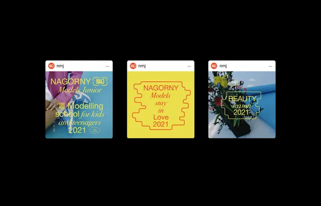
Three square promotional posters for a youth modeling program, each with distinct color overlays and typographic treatments on photographic backgrounds.
Summary
Three square promotional cards for an educational or youth modeling program, each layered with a semi-transparent color overlay and bold display type over photographic backgrounds.
Visual description
Three identical-format square cards are arranged horizontally. The left card features a vibrant purple overlay over a photographic background with white and yellow text reading "NAGORNY" and "Model Junior" with descriptive copy below. The center card uses a bright yellow overlay with black and pink text reading "NAGORNY" and "Models 2021" and "Love What You Do". The right card applies a teal-green overlay over a beach or landscape photograph with white text reading "NAGORNY" and "BEAUTY SCHOOL 2021". Each card has a small circular logo mark in the upper left corner. Sans-serif typefaces in various weights and all-caps styling create visual hierarchy and energy across the series.
Key takeaway
The color-overlay technique transforms raw photography into branded graphics without re-shooting. Applying a bold, flat color (purple, yellow, teal) over photography at moderate opacity allows the underlying image to add visual interest while the overlay unifies the brand. Repeating the same layout and logo positioning across three distinct cards creates a cohesive series. The generous use of white space around text and the consistent all-caps treatment signal modern, professional credibility.
Reuse notes
Effective for educational recruitment, youth programs, or event series that need cohesion across multiple promotional pieces. Works best when the underlying photography has depth or interest even when obscured. Avoid color overlays when the underlying image is the primary hero; the technique works when imagery is supportive, not dominant. Pairs well with energetic, modern branding for Gen-Z audiences.
More like this




Keep what you find
A free account saves references to boards and can send you a weekly email of picks based on what you save.
To see every result, go Pro.