Preview image. Unlock full-res
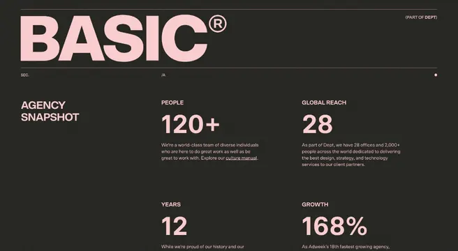
Brand logo and four-KPI stats grid on dark background with warm accent typography and soft pink-brown palette.
Summary
Brand layout showcasing BASIC logo with bold oversized numbers and compact labels presenting four core metrics.
Visual description
Dark charcoal background. Top-left displays "BASIC®" in light pink sans-serif with small "Agency Management" label below in white. Right side shows "120+" in large white typography, followed by "28", "12", and "168%" arranged in a 2x2 grid layout. Each number is rendered in oversized white or warm-pink sans-serif at different scales, with small accompanying text labels in lighter weight below. The composition is left-aligned and text-only, relying on scale contrast and warm color accent (the pink) to establish hierarchy.
Key takeaway
Oversized number typography as a primary visual element with minimal supporting infrastructure. The 2x2 metric grid creates rhythm and scanability without charts or decoration. Pink accent text draws eye to the brand name and contrasts warmly against dark background, conditioning the eye to read that metric as "important."
Reuse notes
Strong for agency case studies, annual reports, portfolio introductions, or B2B landing pages where impact statistics matter more than visual narrative. Works best with 4-6 metrics. The warm-pink accent is versatile; replace with brand color. Scale numbers dramatically; small numbers on this layout read thin and data-less. Pair with larger design context or case-study body copy to explain what the metrics mean.
More like this







Keep what you find
A free account saves references to boards and can send you a weekly email of picks based on what you save.
To see every result, go Pro.