Preview image. Unlock full-res
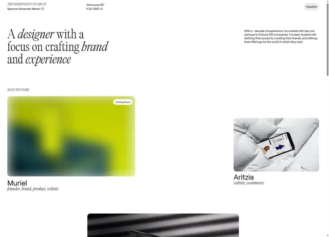
Designer portfolio page with clean serif/sans-serif headline, generous whitespace, and lime-to-teal gradient project card below fold.
Summary
Designer portfolio landing page for Spencer Alexander Marsh combining serif display headline with modern sans-serif body text, accented by a vibrant lime-to-teal gradient card and product imagery.
Visual description
Light gray background with "The Independent Studio of Spencer Alexander Marsh" in small serif italic at top-left. Main headline uses serif display type italic for "designer" and sans-serif for "with a focus on crafting brand and experience", split across three lines. Right column shows biographical text in compact sans-serif. Below, "Selected Work" section displays three project cards: a tall gradient card (lime-yellow to teal) with "Muriel, founder, brand, product, website" label and white "Coming Soon" pill; a white-background smartphone mockup labeled "Aritzia, website, ecommerce" centered; and a cropped dark photo at bottom suggesting product detail.
Key takeaway
The serif/sans hybrid headline hierarchy using italic for emphasis and color to separate roles. The lime-to-teal gradient as a content placeholder that feels expensive despite being empty. Three asymmetric project cards (gradient placeholder, product mockup, cropped image) establish portfolio rhythm without filling every slot.
Reuse notes
Strong for designer/agency landing pages and portfolio intro sections. Works well when case studies are incomplete (the "Coming Soon" device buys time). The gradient placeholder card is especially useful for unavailable work; pair with completed imagery for contrast.
More like this


Keep what you find
A free account saves references to boards and can send you a weekly email of picks based on what you save.
To see every result, go Pro.