Preview image. Unlock full-res
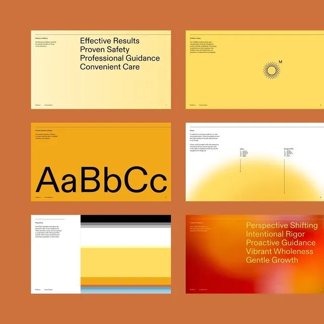
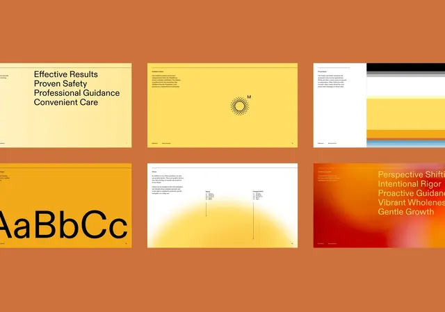
Visual identity system mockup with six modular panels demonstrating typography, color palette, gradients, and product imagery in burnt orange, golden yellow, and cream.
Summary
Multi-page brand identity system featuring six modular design panels: value messaging, color swatch grid, sans-serif specimen (large AaBbCc), product photography with gradient overlay, structured layout grid, and tagline on warm gradient background.
Visual description
Burnt orange background with six cream-and-color panels arranged in a two-by-three grid. Top left has mission statements ("Effective Results", "Proven Safety", "Professional Guidance", "Convenient Care") on cream. Top right displays a dotted geometric mark (M in circle) on bright yellow. Middle left shows oversized black sans-serif (geometric, modern) specimen on golden yellow. Middle right presents product photography with warm yellow-to-orange gradient wash. Bottom left has a systematic layout grid with black stripes and colored sections. Bottom right uses a deep red-to-orange gradient with overlaid text in golden yellow ("Perspective Shifting", "Intentional Rigor", "Proactive Guidance", "Vibrant Wholeness", "Gentle Growth"). All panels maintain clean borders and consistent spacing; small footer text on each panel.
Key takeaway
The warm color harmony across multiple panels without feeling cluttered. The systematic grid approach to showing identity components (marks, type, color, applications, messaging). The use of gradients in background areas rather than forcing every element into a solid swatch. The consistent sizing and spacing that creates visual unity across modular examples.
Reuse notes
Excellent template for healthcare or professional-services brand guidelines. The warm palette reads as trustworthy and human-centered. The modular panel approach scales well for longer guideline documents. Works best when each panel type has genuine content (real product shots, actual messaging, functional layouts) rather than placeholder art.
More like this

Keep what you find
A free account saves references to boards and can send you a weekly email of picks based on what you save.
To see every result, go Pro.