Preview image. Unlock full-res
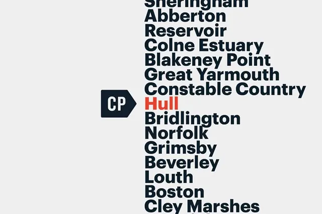
A light-background typographic index of UK place names set in heavy sans-serif, with a single location highlighted in orange to create focal hierarchy.
Summary
A typographic directory of UK place names in heavy, all-caps sans-serif with one location (Hull) spotlit in orange, anchored by a small navy logo badge.
Visual description
Light-gray background with a vertical list of place names right-aligned and set in a bold, high-contrast sans-serif typeface. Each name is separated by a line break, creating a clean columnar layout. The names are printed in dark navy, except "Hull" which appears in a vibrant orange, creating immediate visual hierarchy and stopping the eye. To the left, a small navy shield-shaped logo with white "CP" lettering. The overall aesthetic is austere and functional: zero decoration, maximum information density through typography and negative space.
Key takeaway
Using a single accent color to call out one item from a long list is efficient and creates clear focus without adding visual clutter. The restraint of all-caps, heavy typeface, and generous leading makes the typography itself the design. The minimal badge (CP logo) provides branding without competing for attention.
Reuse notes
Excellent for institutional directories, geographic indexes, transit maps, or data-focused information design. Works well for government, cultural, or historical applications where authority and clarity are essential. The orange accent would pair well with any additional data layers, callouts, or interactive states.
More like this



Keep what you find
A free account saves references to boards and can send you a weekly email of picks based on what you save.
To see every result, go Pro.