Preview image. Unlock full-res
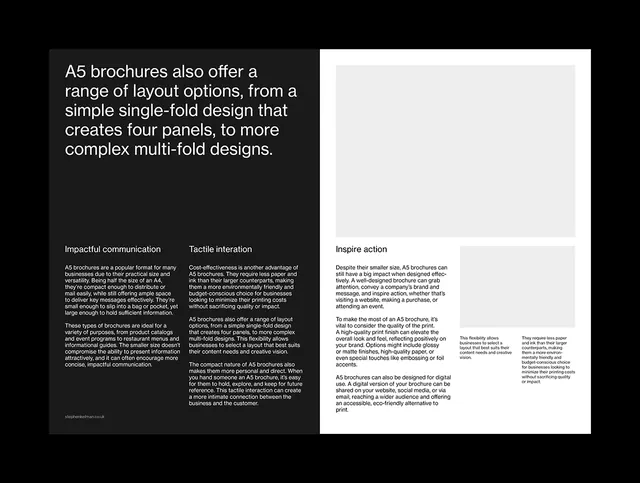
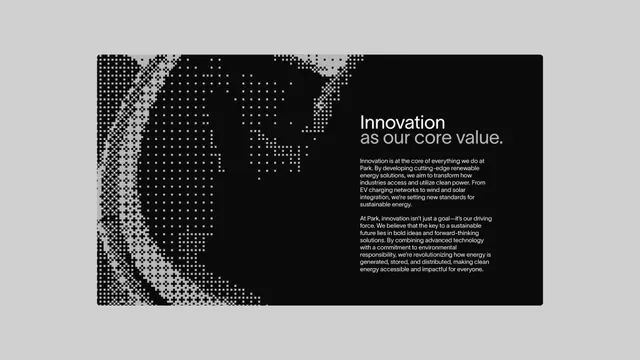
Two-page printed brochure layout with stark monochrome contrast, dense body text, and structured typographic hierarchy for corporate content.
Summary
Two-page printed brochure with stark black-and-white contrast, dense body text, and structured typographic hierarchy demonstrating disciplined corporate communication.
Visual description
Two facing pages: left page is deep black background with white and light-grey sans-serif text in tight, columnar paragraphs. Right page is predominantly white with black text, title, and supporting paragraphs arranged in a structured grid. Both pages use generous negative space between text blocks, justified sans-serif typeface, and consistent margins. Hierarchy is established purely through type scale, weight, and positioning, with no imagery or decorative elements. Subtle grey accent lines separate content sections.
Key takeaway
Extreme contrast and pure typography create authority and clarity. Dense information stays readable through modular layout, adequate spacing, and consistent typeface. This approach prioritizes legibility and trust over visual decoration.
Reuse notes
Ideal for corporate reports, annual reports, or information-dense marketing materials where credibility matters. Works best for print-first or print-quality digital applications. The stark monochrome palette requires strong typography and careful spacing to avoid monotony.
More like this





Keep what you find
A free account saves references to boards and can send you a weekly email of picks based on what you save.
To see every result, go Pro.