Preview image. Unlock full-res
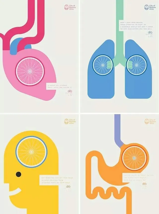
Four-panel medical infographic using geometric shapes and bright colors to illustrate human body systems, commissioned by City of Buenos Aires.
Summary
Four-panel medical infographic using geometric shapes and bright colors to illustrate human body systems, commissioned by City of Buenos Aires.
Visual description
Four equally sized poster panels arranged in a 2x2 grid, each depicting a different body system as a colorful geometric shape with an integrated bicycle wheel icon at center. Top-left: hot pink organic shape resembling stomach/digestive tract with circular wheel containing stomach illustration and mint-blue accent curve. Top-right: two large overlapping blue shapes resembling lungs with concentric circular wheels and turquoise accents, surrounded by thin descriptive text. Bottom-left: bright yellow rounded head shape with single dark dot (eye), blue wheel showing brain/head cross-section, small text block. Bottom-right: orange wavy shape resembling intestines with blue wheel at center and purple vertical spine element. All panels feature City of Buenos Aires logo (circular seal, top-right corner of each), minimal sans-serif labels, light cream background, and small bicycle icons in corners. Typography appears institutional and informative, supporting healthcare education context.
Key takeaway
The geometric abstraction of anatomical systems into simple, memorable shapes; the use of a single bright color per panel plus a blue accent wheel to unify the series; the integration of circular detail (bicycle wheel) as both graphic element and informational anchor; the balance of visual simplicity with enough anatomical accuracy to be educational.
Reuse notes
Strong for health education campaigns, public health organizations, or medical illustration portfolios. The geometric vocabulary works well for infographics targeting adults and families (not overly simplistic or childish). Caution: the design prioritizes visual clarity and accessibility over anatomical precision, making it ideal for awareness/education rather than clinical reference. The color coding per body system is easy to memorize and repurpose for different health topics.
More like this





Keep what you find
A free account saves references to boards and can send you a weekly email of picks based on what you save.
To see every result, go Pro.