Preview image. Unlock full-res
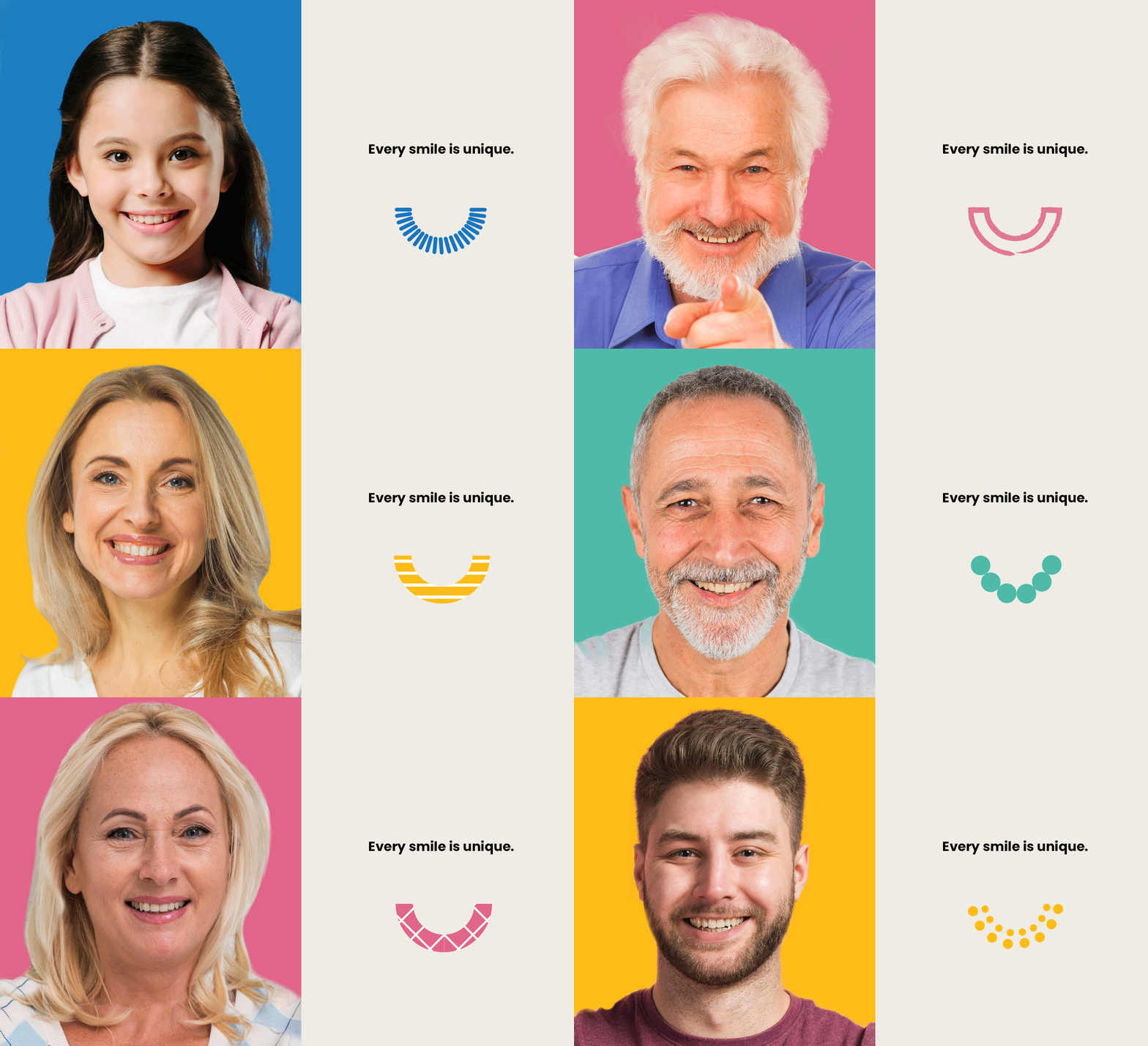
A split-screen dental marketing composition with a smiling child's portrait on a cobalt background (left) and the headline 'Every smile is unique' paired with a minimalist line-drawn smile icon (right) in cream and teal tones.
Summary
A split-screen dental marketing composition with a smiling child's portrait on a cobalt background (left) and the headline "Every smile is unique" paired with a minimalist line-drawn smile icon (right) in cream and teal tones.
Visual description
Left half: a close portrait of a smiling child with shoulder-length dark hair against a vibrant cobalt blue background. The child wears a soft pink cardigan over a cream-colored shirt, photo shot against solid color with professional studio lighting. Right half: the text "Every smile is unique" in large bold black sans-serif atop a cream background, with a minimalist smile icon below rendered as a series of horizontal lines in bright teal/cobalt blue forming a curved grin. The proportions split the composition 50/50 vertically, balancing human warmth on the left with geometric abstraction on the right. No additional graphics or text clutter the composition.
Key takeaway
The straightforward symmetry: portraiture plus geometric icon create a balance between relatable humanity and modern branded identity. The smile icon using simple parallel lines is memorable, scalable, and instantly communicates the category (dental, orthodontics, wellness). The color contrast (cobalt vs cream) reads as premium and contemporary without feeling cold.
Reuse notes
Strong for pediatric healthcare, dental practices, orthodontics, and any children's medical service where warmth and approachability matter. The split works especially well when one half is a before/after or solution/benefit pairing. The teal smile icon can become a repeating brand element across cards, buttons, or social. Avoid if the brand voice skews technical or corporate-formal; the playful icon signals friendly, youthful energy.
More like this






Keep what you find
A free account saves references to boards and can send you a weekly email of picks based on what you save.
To see every result, go Pro.