Preview image. Unlock full-res
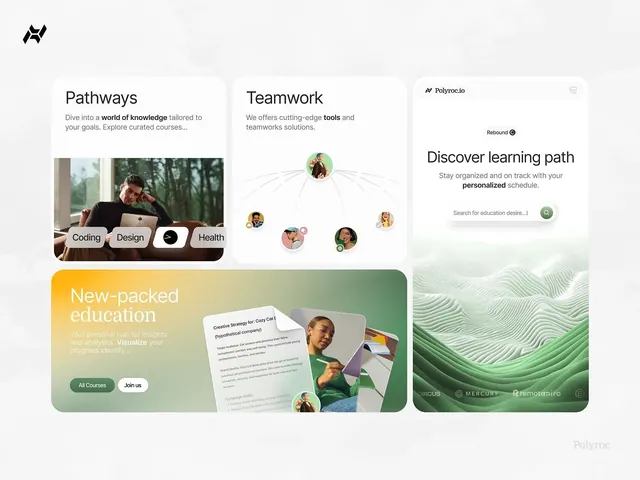
Modular card-based dashboard for an edtech platform showing learning pathways, instructor profiles, and personalized course discovery.
Summary
A minimalist edtech dashboard grid using muted teal and sage cards with photography, learning-path diagrams, and a decorative wavy pattern footer.
Visual description
Four distinct rounded-rectangle cards arranged in a 2x2 grid on a light gray background. Top-left card labeled "Pathways" shows a portrait photo of a person at a desk with topic badges (Coding, Design, Health). Top-right "Teamwork" displays a network diagram of circular avatars connected by lines, representing a team structure. Bottom-left "New-packed education" features a yellow-to-sage gradient background with a call-to-action buttons and a sample course card showing a person and strategy document. Bottom-right displays a delicate wavy line pattern in muted green and white. A small teal search input ("Search for education desire...") appears in the top-right section. Sidebar branding (Polyroc) sits at top-left. All text uses clean sans-serif typography in dark gray or black.
Key takeaway
The muted teal-and-sage color palette that feels calming without looking tired. The mix of photography, diagrams, and abstract pattern (the wavy background) creating visual variety within a constrained, modular grid. Rounded corners and generous negative space keeping the density low despite multiple information types.
Reuse notes
Effective for edtech, learning platforms, or B2B SaaS dashboards. The soft neutral palette works across industries (healthcare, corporate learning, consulting). The modular card approach scales well; each card can stand alone or group into larger layouts. Avoid using this aesthetic for high-energy or youth-focused brands; the calm mood works better for professional or mature audiences.
More like this



Keep what you find
A free account saves references to boards and can send you a weekly email of picks based on what you save.
To see every result, go Pro.