Preview image. Unlock full-res
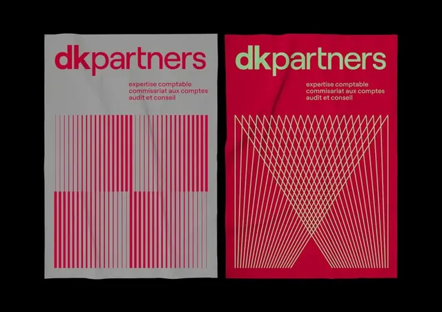
Split-panel brand system pairing vertical stripes on gray with diagonal crosshatch on crimson, anchored by a bold wordmark.
Summary
Split-panel brand identity for a professional services firm, dividing space between vertical stripe pattern (gray ground) and diagonal crosshatch (dark crimson), with a bold sans-serif wordmark.
Visual description
Two identity systems shown side by side. Left: pale gray panel with "dkpartners" wordmark in dark red, tagline below, and a dense field of evenly spaced vertical red and darker stripes stacked in two rows. Right: deep crimson panel with the same wordmark in pale yellow-green, tagline aligned, and a diagonal lattice pattern rendered in fine white lines forming a diamond-weave effect. Both panels are roughly square, high-contrast, and grid-aligned.
Key takeaway
Two distinct pattern languages (parallel vs. diagonal) applied to the same brand mark, instantly differentiating variants without changing the word. The stripe density creates visual weight on the gray while the crosshatch breathes on the deep ground. Reversing the mark color between panels strengthens the contrast.
Reuse notes
Strong reference for professional services, fintech, or consulting identities that need system flexibility without complexity. Works best at scale (large format, signage, printed applications). The vertical stripe reads as structured and rhythmic; use where order and precision matter.
More like this







Keep what you find
A free account saves references to boards and can send you a weekly email of picks based on what you save.
To see every result, go Pro.