Preview image. Unlock full-res
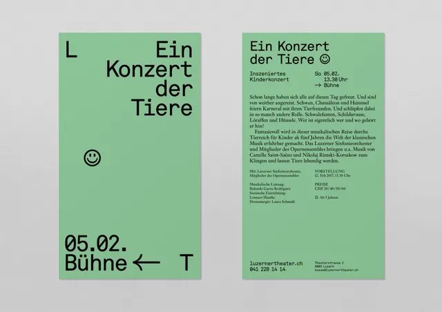
Two-column concert poster in muted sage green and greige with asymmetric type weights and a soft geometric sensibility.
Summary
Two-column concert poster for "Ein Konzert der Tiere" split between a bold, minimalist left side and a type-dense information column on muted green and greige fields.
Visual description
A vertical two-column layout features the left column in soft sage green with the title "Ein Konzert der Tiere" set in a large, open sans-serif display typeface, ranged left with heavy left margin. A small circular icon sits below the title. The right column in warm greige hosts dense, small-scale body copy listing concert details and information in a compact sans-serif. The two columns are distinct in color (green and greige) and typographic scale (large headline vs. small body), but unified by a consistent line-height and neutral palette. A small arrow or graphic accent points left toward the date and venue information at the bottom of the left column.
Key takeaway
The asymmetric column strategy: pairing a generous typographic hero with a tight information column creates visual hierarchy without hierarchy of color or weight alone. The muted, earthy palette (sage green paired with warm greige rather than pure white) gives the poster a warm, non-institutional feel suitable for arts events.
Reuse notes
Ideal for concert posters, theater announcements, or cultural events targeting sophisticated audiences. The two-column split allows the title to breathe while still accommodating detailed information (date, time, ticket links, lineup). The muted color palette reads more gallery than commercial; would be less effective for high-energy events or youth-oriented promotions. German-language text is historically authentic; adapt typography handling to other languages with care.
More like this

Keep what you find
A free account saves references to boards and can send you a weekly email of picks based on what you save.
To see every result, go Pro.