Preview image. Unlock full-res
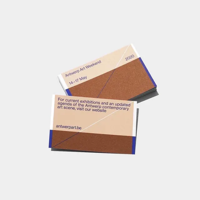
Layered poster for an art festival, using angled translucent overlays in tan, terracotta, and navy to reveal typography across multiple planes.
Summary
Layered poster for an art festival, using angled translucent overlays in tan, terracotta, and navy to reveal typography across multiple planes.
Visual description
An isometric composition of overlapping rectangular cards, each angled and slightly offset to create depth and visual rhythm. The palette is warm and grounded: warm beige, terracotta brown, and navy blue on a light gray background. Text announcing "Antwerp Art Weekend," event dates "14-17 May," and the URL "antwerpart.be" is broken across the different layers, forcing the viewer's eye to read the design as a physical, stackable system. Sans-serif typeface in a neutral weight; the angled arrangement drives visual impact rather than typographic variation.
Key takeaway
The layered, angled-plane approach transforms a flat poster into a sculptural composition that feels 3D without actually being rendered. The constraint of revealing text across multiple surfaces forces hierarchy and pacing. The warm, refined color palette grounds the design in cultural and editorial contexts.
Reuse notes
Strong approach for event promotion, gallery or museum marketing, and cultural identity systems. Works particularly well when you want to suggest depth and sophistication without resorting to photographic imagery or render effects. Best used when the event or venue itself has a contemporary, design-forward audience.
More like this


Keep what you find
A free account saves references to boards and can send you a weekly email of picks based on what you save.
To see every result, go Pro.