Preview image. Unlock full-res
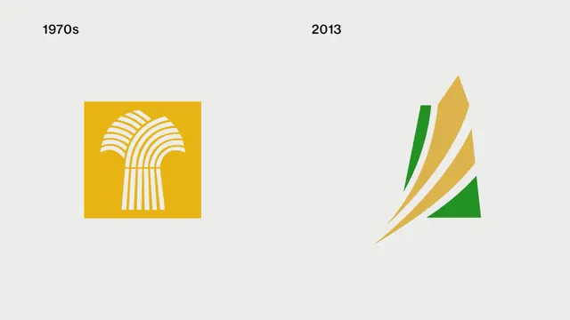
A side-by-side comparison showing the evolution of a logo from the 1970s to 2013, highlighting a shift from a boxed, detailed graphic to a minimalist, abstract form.
Summary
A side-by-side comparison showing the evolution of a logo from the 1970s to 2013, highlighting a shift from a boxed, detailed graphic to a minimalist, abstract form.
Visual description
The image features two logos on a gray background with dates above them. The 1970s logo is a yellow square containing a stylized, multi-layered arch design, while the 2013 logo is a minimalist, abstract shape composed of overlapping curved planes in shades of gold, tan, and green.
Key takeaway
The design demonstrates a trend toward simplification and abstraction over time, moving from a contained, literal icon to a fluid, open form.
Reuse notes
This layout can be used as a template for showcasing brand identity evolution or historical design changes.
More like this





Keep what you find
A free account saves references to boards and can send you a weekly email of picks based on what you save.
To see every result, go Pro.