Preview image. Unlock full-res
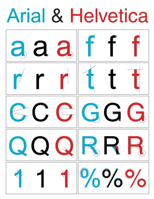
A comparative type specimen chart displaying the differences between Arial and Helvetica fonts through lowercase and uppercase letters, numbers, and symbols.
Summary
A comparative type specimen chart displaying the differences between Arial and Helvetica fonts through lowercase and uppercase letters, numbers, and symbols.
Visual description
The image features a grid layout with white rectangular cells containing letterforms. Each cell presents three versions of a character: a blue Arial version, a black Helvetica version, and a red Helvetica version, often with dashed lines indicating structural differences.
Key takeaway
Use a side-by-side comparative grid with color-coding to highlight subtle geometric differences between similar typefaces.
Reuse notes
Use this layout when creating font documentation or educational materials to demonstrate typographic nuances.
More like this


Keep what you find
A free account saves references to boards and can send you a weekly email of picks based on what you save.
To see every result, go Pro.