Preview image. Unlock full-res
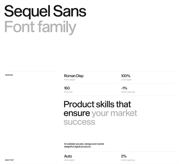
Minimalist type specification sheet for Sequel Sans font family, displaying headline settings, measurements, and sample body text on a light background.
Summary
A technical type specification reference for Sequel Sans, displaying font metrics, sizing rules, and usage examples for both headline and body text applications.
Visual description
Clean white background with the font name "Sequel Sans" and subtitle "Font family" positioned prominently at the top in the typeface itself. Below sits a structured specification grid showing: headline usage with Roman Disp weight at 160pt size, 100 percent line height, and -1 percent letter spacing. Body text section displays sample copy in black sans-serif with accompanying metrics labels (line height: Auto, letter spacing: 2 percent). The layout uses left alignment with gray labels and black metric values for clear visual hierarchy and scanability.
Key takeaway
The simple two-column grid structure makes technical specifications easy to read without feeling sterile. Gray labels paired with black values create clear information hierarchy. The generous whitespace prevents the metric data from feeling dense. Showing both headline and body text contexts makes the font's range immediately apparent.
Reuse notes
Essential reference for designers building branded type systems or font-pairing documentation. Use this layout structure when specifying web or print typography settings. Works well as a template for other font families. The minimal color palette (white, gray, black) suits both light and dark mode adaptation.
More like this


Keep what you find
A free account saves references to boards and can send you a weekly email of picks based on what you save.
To see every result, go Pro.