Preview image. Unlock full-res
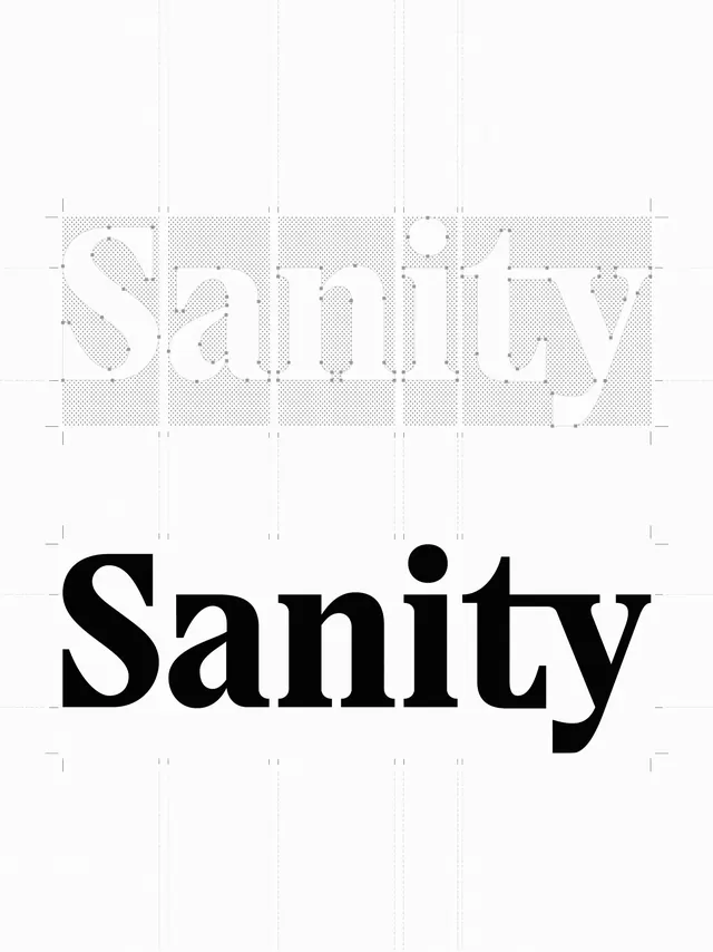
A design reference showing the construction and grid alignment of the wordmark 'Sanity'.
Summary
A design reference showing the construction and grid alignment of the wordmark 'Sanity'.
Visual description
The image displays the wordmark 'Sanity' in a bold serif typeface. The top version shows the wordmark in a light grey with vector anchor points and a grid overlay, while the bottom version shows the solid black finished wordmark.
Key takeaway
Use vector anchor points and a geometric grid to ensure precise mathematical alignment and proportions in custom typography.
Reuse notes
Use this approach when creating brand identities that require highly structured and mathematically balanced wordmarks.
More like this
Keep what you find
A free account saves references to boards and can send you a weekly email of picks based on what you save.
To see every result, go Pro.