Preview image. Unlock full-res
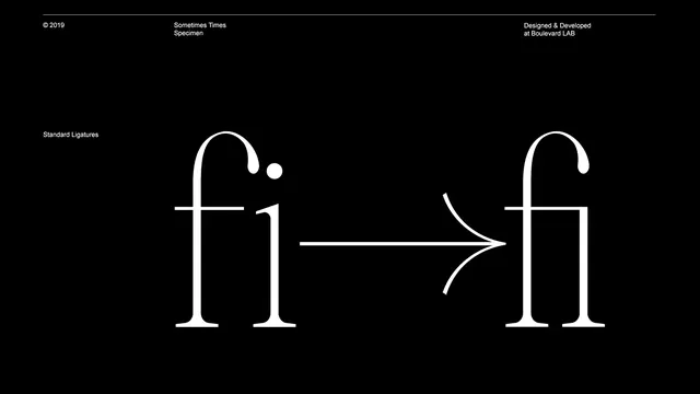
A typographic specimen demonstrating the transition from standard characters to a ligature for the letters 'fi'.
Summary
A typographic specimen demonstrating the transition from standard characters to a ligature for the letters 'fi'.
Visual description
The image features white serif letterforms on a solid black background. On the left, the letters 'f' and 'i' are shown separately, while an arrow points to the right to show the 'fi' ligature. Small white text is placed in the corners and above the main subject.
Key takeaway
Use a clear visual comparison with an arrow to demonstrate the functional difference between standard kerning and a typographic ligature.
Reuse notes
Use this layout when presenting font specimens or explaining typographic details in a brand guideline or design presentation.
More like this

Keep what you find
A free account saves references to boards and can send you a weekly email of picks based on what you save.
To see every result, go Pro.