Preview image. Unlock full-res
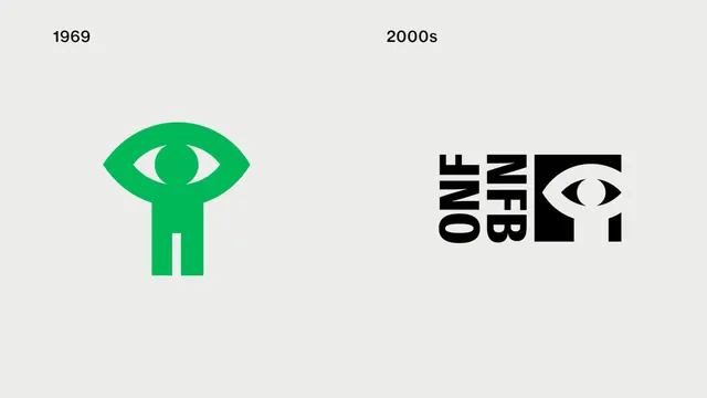
A side-by-side comparison showing the evolution of a brand identity from 1969 to the 2000s.
Summary
A side-by-side comparison showing the evolution of a brand identity from 1969 to the 2000s.
Visual description
The image displays two versions of a logo on a light grey background. On the left, a green icon from 1969 features a stylized eye shape integrated into a human figure. On the right, a 2000s version uses black condensed letters 'ONF' and 'NFB' alongside a black square containing a white eye icon.
Key takeaway
Simplifying complex icons into geometric, high-contrast shapes ensures brand longevity and scalability.
Reuse notes
Use this layout when presenting brand history or design iterations in a portfolio or case study.
More like this


Keep what you find
A free account saves references to boards and can send you a weekly email of picks based on what you save.
To see every result, go Pro.