Preview image. Unlock full-res
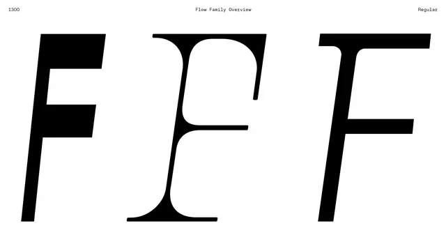
Three oversized black letter F forms compare sans, serif italic, and sans roman styles on a white specimen sheet.
Summary
A font family overview lines up three capital F characters to contrast sans italic, calligraphic serif italic, and bold sans roman forms.
Visual description
Each F fills roughly a third of a wide white field. Small monospaced captions at the top read 1300, Flow Family Overview, and Regular. The left F is a slanted geometric sans, the center a flowing serif with curved terminals, and the right an upright block sans with subtle corner rounding.
Key takeaway
One letter at display scale makes style differences between related cuts immediately obvious.
Reuse notes
Use for type foundry marketing, family launch pages, or pairing decisions where a single glyph comparison is clearer than full words.
More like this





Keep what you find
A free account saves references to boards and can send you a weekly email of picks based on what you save.
To see every result, go Pro.