Preview image. Unlock full-res
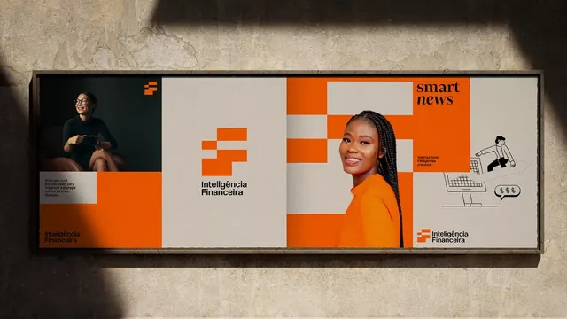
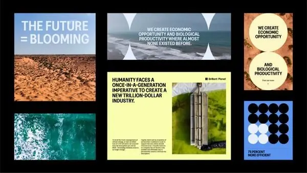
Horizontal corporate-clean mockup with a modular grid alternating portrait photographs, orange geometric blocks, and white spacer modules.
Summary
Horizontal corporate-clean mockup with a modular grid alternating portrait photographs, orange geometric blocks, and white spacer modules.
Visual description
A rectangular horizontal composition divided into a strict geometric grid of equal-sized squares. The grid contains three types of modules: square portrait photographs cropped tight around the subjects; solid blocks of bright orange-red; and white spacer blocks with minimal typography. Portraits appear in the top-left, center, and scattered positions; orange blocks punctuate the grid in roughly even distribution, creating visual rhythm. Small typographic details appear within some white modules in a clean, modern sans-serif. The overall color palette is restrained: black-and-white photography, bright warm orange, dark charcoal text on white or light gray. The composition feels architectural, with the grid creating balance despite the varied content within each square.
Key takeaway
The modular square-grid approach is infinitely flexible: swap portraits for product shots, testimonials, or statistics; adjust the ratio of photo to color blocks to emphasize content. The bright orange acts as a powerful accent color that guides the eye without overwhelming; it appears in roughly 20-30% of the grid. This pattern works for team pages, corporate portfolios, fintech/insurance collateral, or case-study layouts where you need to mix photography with typography or visual elements on a fixed grid.
Reuse notes
Ideal for fintech, corporate B2B, or insurance marketing where you need to convey team members, company structure, or case studies. The grid forces visual harmony even with diverse content. Works at any scale (website section, poster, print brochure). The orange-on-black-and-white palette is approachable but authoritative; consider adjusting to cooler tones (blue/teal) for tech or healthcare, warmer earth tones for sustainability/real-estate.
More like this






Keep what you find
A free account saves references to boards and can send you a weekly email of picks based on what you save.
To see every result, go Pro.