Preview image. Unlock full-res
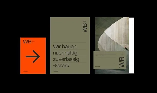
Three-panel brand identity system showing minimal corporate collateral with bold orange arrow, olive-tone panels, and architectural photography.
Summary
A three-panel brand identity system combining bold geometric shapes, minimal typography, and architectural imagery to convey construction or sustainability expertise.
Visual description
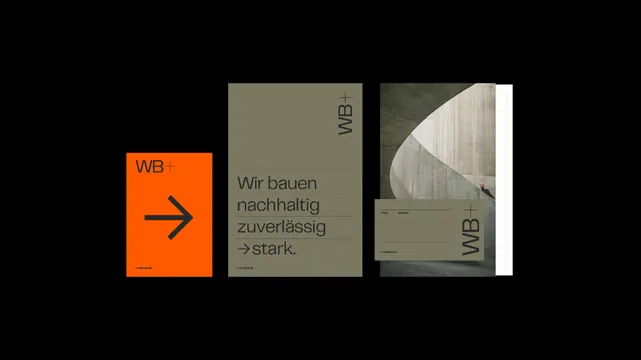
Triptych layout with black background. Left panel: bright orange square with a minimalist right-facing arrow icon in black and the logotype "WB+" in small serif at the baseline. Center panel: olive-tan/khaki ground with German-language headline text ("Wir bauen nachhaltig zuverlassig / stark") set in dark sans-serif type, plus the upright "WB" logotype. Right panel: close-up photograph of raw wood siding or architectural detail, cropped to show texture and curves, with a large sage/tan ground and "WB" placed horizontally at the baseline. Minimal geometric grid holds all three elements together.
Key takeaway
The color system: orange as a single accent color commanding attention against muted, natural palettes. The arrow as a simple directional symbol that communicates forward movement and professionalism. The mixing of photography, pure color, and typography across panels without ornament. The small, anchored logotype appearing consistently across all three variations reinforces brand coherence.
Reuse notes
Ideal for construction, engineering, sustainability, or consulting brands. The bold orange works as a call-to-action or differentiator. The Swiss-influenced three-column structure feels architectural and trustworthy. The approach is best applied to stationary, environmental branding, or multi-page presentations where the system can repeat.
More like this




Keep what you find
A free account saves references to boards and can send you a weekly email of picks based on what you save.
To see every result, go Pro.