Preview image. Unlock full-res
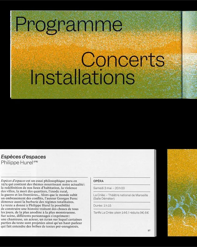
Concert and installation listing poster using large minimalist type layered over a gradient field shifting from green through yellow to cream.
Summary
A cultural institution's program poster displaying three typographic focal points stacked over a warm gradient background transitioning from olive-green to golden yellow to cream, with bilingual concert and event details below.
Visual description
Large display typography in dark gray sits atop a saturated gradient field. The three main lines (Programme, Concerts, Installations) are positioned at different depths against the color shift, creating visual hierarchy through scale and position rather than weight. Below the gradient panel, a two-column layout in white with descriptive text and schedule information references an institution (La Crée, Théâtre national de Marseille) and event details. The gradient uses analogous warm hues that create optical motion without animation. Type is strictly sans-serif, set generous and tight, with generous line spacing emphasizing elegance over information density.
Key takeaway
The gradient field becomes a design system unto itself, making typography feel like it floats in color rather than sitting on a flat background. Minimal hierarchy through scale and vertical distribution works better than bold weights. Educational/cultural institutions can borrow this approach to give program schedules visual distinction without added decorative elements.
Reuse notes
Strong for cultural event posters, museum program listings, arts organizations, and educational institutions. The warm earth-tone gradient anchors the design in both digital and print contexts. Works best when the event details can be minimal; avoid cramping text into the gradient zone.
More like this
Keep what you find
A free account saves references to boards and can send you a weekly email of picks based on what you save.
To see every result, go Pro.