Preview image. Unlock full-res
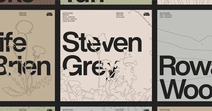
Multi-panel editorial layout pairing bold sans-serif headlines with delicate botanical line-drawing illustrations across beige, cream, and gray grounds.
Summary
Multi-panel editorial layout pairing bold sans-serif headlines with delicate botanical line-drawing illustrations across beige, cream, and gray grounds.
Visual description
A three-panel composition with thick black dividers between each section. Left panel: cream ground with a pen-and-ink flowering plant outline, paired with large dark sans-serif type. Center panel: soft beige ground with layered herb/wildflower line drawings across the full height, topped with a substantial black sans-serif headline set over the botanical artwork. Right panel: pale gray ground with a large sans-serif word fragment. Each panel bears a small black label header in condensed monospace (regions, activities, etc.). The grid system anchors the layout; organic line-drawn vegetation contrasts against geometric typography and structured field colors.
Key takeaway
Pairing bold display type with subtle hand-drawn botanical line art creates editorial sophistication. The modular grid + thick black frame lines compartmentalize information while the consistent color palette and illustration style unify the whole. Labels in condensed monospace add hierarchy and reference-sheet clarity.
Reuse notes
Strong for outdoor recreation brands, nature publishing, lifestyle/craft retailers, or editorial spreads. The botanical hand-drawing adds warmth without kitsch. Works particularly well when regions, activities, or product categories need clear visual separation. Combine a limited warm/earthy palette with bold type for impact.
More like this



Keep what you find
A free account saves references to boards and can send you a weekly email of picks based on what you save.
To see every result, go Pro.