Preview image. Unlock full-res
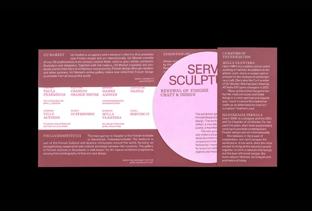
A trifold or accordion brochure mockup in black and pale pink, featuring a large magenta circular callout containing 'SCULTY' text, flanked by structured text columns in a gallery or institutional aesthetic.
Summary
A trifold brochure mockup in black and pale pink with a large magenta circular element containing the word 'SCULTY' positioned as the primary focal point, surrounded by structured columns of gray body text and sans-serif headings on white space.
Visual description
The layout divides into three vertical panels. Left panel: dense gray body text in narrow column. Center panel: a pale-pink background dominates the upper and lower thirds, with a large magenta circle positioned center-left containing white sans-serif display text ('SCULTY'). Right panel: additional gray columns of text continuing from the left, maintaining typographic grid alignment. The color palette alternates between pure black text on pale pink and pale pink text on dark backgrounds, creating stark, high-contrast readability. Negative white space surrounds key elements, emphasizing the circular callout as the compositional anchor. Typography is entirely sans-serif except for the prominent magenta display word.
Key takeaway
The large colored circle as a compositional anchor draws the eye while serving as a secondary information container (the callout word or name). Alternating the background color (black/pale pink) across panels creates visual rhythm and page-turning momentum in a trifold. The structured column grid with consistent margin spacing ensures content remains scannable and professional even when densely typeset. High contrast between text and background maximizes legibility and institutional gravitas.
Reuse notes
Ideal for gallery programs, museum guides, nonprofit brochures, or any institution positioning itself as serious and curated. The magenta accent works as a signature brand color without overwhelming the clean aesthetic. Adapt the callout text and column content, but maintain the high-contrast, grid-based structure for consistency. Works well at medium scale (8-10pt body text, 36pt+ display).
More like this

Keep what you find
A free account saves references to boards and can send you a weekly email of picks based on what you save.
To see every result, go Pro.