Preview image. Unlock full-res
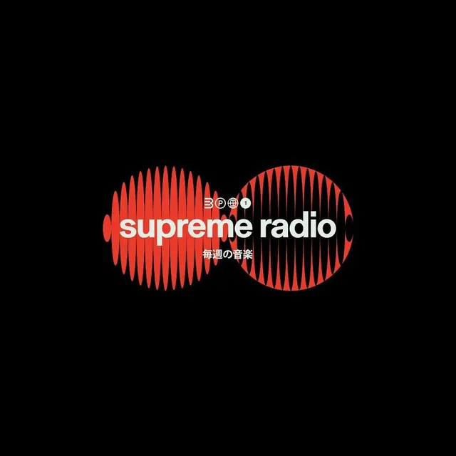
A symmetrical waveform logo for Supreme Radio rendered in vibrant coral-red against black, with sans-serif wordmark and Japanese subtext.
Summary
Supreme Radio's identity centers on a symmetrical waveform mark composed of two opposing sound-wave patterns in vibrant coral-red, anchored by stacked white wordmark and Japanese subtitle on pure black.
Visual description
A centered composition on black background featuring a large geometric logo: two opposing circular halves with vertical-line waveform patterns creating a symmetrical, almost butterfly-like shape in bright coral-red. The red is positioned to create maximum contrast against the black void. Centered within and overlaid on the mark is a small circular icon containing "BPOI" in white outline. Below the mark, "supreme radio" appears in bold, sans-serif white type, all lowercase, with "毎週の音楽" (weekly music) in smaller Japanese characters directly beneath. The entire composition is cleanly centered and uses only three colors: black, white, coral-red.
Key takeaway
The symmetrical waveform creates an immediately recognizable icon that reads as both sound and modern simplicity. Overlaying the wordmark directly on the icon makes typography part of the mark itself, not an afterthought. Using only two high-contrast accent colors (red and white) on black creates maximum visual impact and works at any scale. The bilingual approach (English + Japanese) signals global reach without adding visual clutter.
Reuse notes
A strong reference for audio, music, streaming, and broadcast branding. The minimal geometric approach appeals to tech-forward platforms and contemporary media brands. The symmetry suggests balance, precision, and reliability. Works equally well as a button, favicon, or large format. The coral-red is warm enough to feel energetic, not cold or corporate.
More like this






Keep what you find
A free account saves references to boards and can send you a weekly email of picks based on what you save.
To see every result, go Pro.