Preview image. Unlock full-res
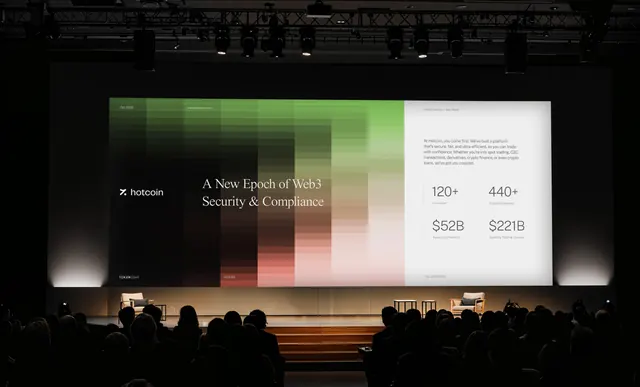
A dark-mode presentation slide with a soft green-to-tan gradient square displaying layered data, flanked by crypto/fintech metrics and company branding.
Summary
A dark-mode presentation slide with a soft green-to-tan gradient square displaying layered data, flanked by crypto/fintech metrics and company branding.
Visual description
A large projection screen on a darkened stage displays a dark background with two main sections. On the left, the "hotcoin" logo sits above a soft gradient square that transitions from emerald green at top-left, through warm browns and tans, to pale beige at bottom-right, with faint underlying grid or heatmap texture visible. Centered white serif copy reads "A New Epoch of Web3 Security & Compliance". On the right side, key metrics are displayed: "120+" and "440+" in large sans-serif figures with subtext, and "$52B" and "$221B" in massive typography below. The stage below the screen shows silhouettes of an audience, grounding the presentation context.
Key takeaway
The gradient-overlay technique communicates complexity (data layers, heatmaps) without literal charts, lending visual sophistication. Pairing a dense-looking gradient with sparse, huge typography creates contrast and makes metrics scannable. The dark background + emerald accent reads high-stakes and technical while remaining approachable.
Reuse notes
Ideal for fintech/crypto pitch decks or investor presentations needing to convey both data density and clarity. The earthy gradient palette softens the technical subject matter; the oversized metrics anchor attention. Works on large screens; ensure accessibility of the overlaid text against the gradient.
More like this


Keep what you find
A free account saves references to boards and can send you a weekly email of picks based on what you save.
To see every result, go Pro.