Preview image. Unlock full-res
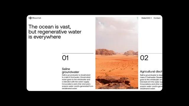
Two-column card layout juxtaposing saline groundwater against agricultural drought sustainability concepts over arid landscape photography.
Summary
A two-column comparison card set contrasting saline groundwater (left, labeled 01) against agricultural drought solutions (right, labeled 02) over tonal desert landscape photography that spans both panels.
Visual description
Horizontal card layout on a clean white background. Left card labeled "01" with "Saline groundwater" heading and body copy over a tan, rock-strewn desert plateau. Right card labeled "02" with "Agricultural drought" heading and body copy over deeper, orangish-brown arid terrain featuring a lone hilltop. Both cards share a continuous desert landscape image that bleeds across the vertical divider. A sans-serif headline at the top, left-aligned ("The ocean is vast, but regenerative water is everywhere"), sits above the numbered cards in a muted dark brown. All text is left-justified; typography is clean and hierarchical, using weight contrast to emphasize labels and section numbers.
Key takeaway
The split numeric labeling (01, 02) anchoring parallel concepts. The continuous background image running under both cards to unify the composition while maintaining clear separation. The restrained color play: terracotta and sand tones in the photo against near-black text and white card grounds.
Reuse notes
Strong pattern for environmental, nonprofit, or B2B impact storytelling when you need to compare two related concepts side-by-side. Works well for before-and-after, cause-and-effect, or parallel solutions. Landscape photography grounds the abstract concepts in tangible reality.
More like this





Keep what you find
A free account saves references to boards and can send you a weekly email of picks based on what you save.
To see every result, go Pro.