Preview image. Unlock full-res
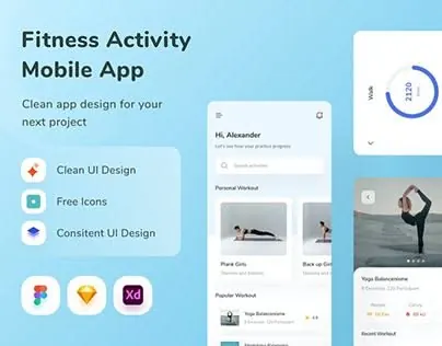
Fitness app interface showing workout tracking screens with circular progress indicator, video content grid, and clean blue-teal color system.
Summary
Promotional mockup for a fitness app showing the user interface across three overlapping screen frames, highlighting workout tracking, video-based instruction, and a circular progress indicator.
Visual description
Three mobile UI frames arranged in an overlapping composition on a light blue-cyan background. Left frame displays the app launch screen with headline "Fitness Activity Mobile App", three value propositions (Clean UI Design, Free Icons, Consistent UI Design) as rounded pill badges with icons, and a row of colored circular app badges at the bottom. Center frame shows a personalized user dashboard with a user profile section at top (name, avatar), a featured "Personal Workout" video thumbnail, and a "Popular Workouts" carousel below. Right frame displays a workout detail view with the circular progress ring indicator in teal (appears to show percentage completion) and larger video content preview below. The color palette is light and cool: white backgrounds, soft cool blues, teal accents, and dark gray text. All text uses clean sans-serif typography. Icons are minimal and colorful.
Key takeaway
The circular progress indicator as a visual anchor for status communication. The stacked-cards approach to showing app hierarchy and flow in a single hero image. The use of muted cool tones with teal accent color for a calm, professional fitness feel without aggression.
Reuse notes
Strong for fitness app launches, health product pages, or wellness tool marketing. The multi-frame overlay technique works well for showing a user journey or feature progression. The friendly tone and clean components pair well with onboarding flows and feature-highlight pages. Works especially well on white or very light backgrounds.