Preview image. Unlock full-res
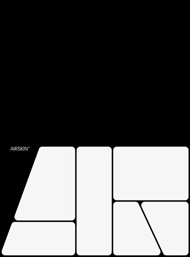
Cosmetics brand identity using a modular grid of rounded white rectangles in varying sizes against pure black, with minimal serif logotype.
Summary
A cosmetics brand using a modular grid system of rounded white rectangles in varying proportions as its visual language, with a minimal serif logotype, anchored by pure black background.
Visual description
Pure black background with a grid of eight rounded-corner white rectangles arranged in an asymmetric modular layout, ranging from small square to large portrait and landscape formats. The "AIRSKIN" logotype in a clean, narrow serif typeface sits in the lower left, roughly 10% the scale of the largest rectangle. All white shapes align to an implied grid with consistent spacing between them, emphasizing precision and structure.
Key takeaway
A modular rectangle grid becomes a repeatable identity system: scale and proportion variation within one constraint creates visual rhythm and endless layout flexibility. The logotype-to-grid size ratio keeps type from dominating. Pure monochrome avoids distracting from the geometric grammar.
Reuse notes
Strong for beauty, skincare, and premium retail brands. Works for a design system or layout template. The white-on-black intensity suits digital display and print equally. Requires a name/wordmark that reads well at small scale.
More like this


![[Be] Life. brand wordmark, minimal, swiss, dark](https://images.vasa.works/_t/graphics/ae6d55b3e71b64d50aa463d6e9390702.webp)
Keep what you find
A free account saves references to boards and can send you a weekly email of picks based on what you save.
To see every result, go Pro.