Preview image. Unlock full-res
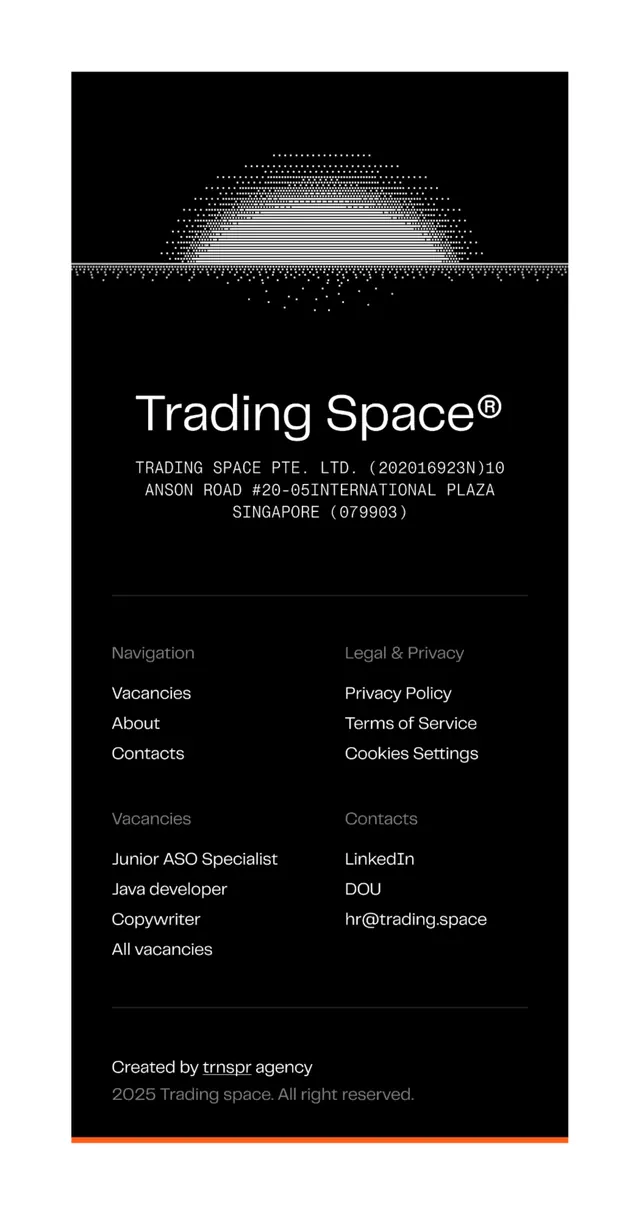
A dark corporate footer design for a Singapore-based company featuring a minimalist dotted-line separator graphic in white, company branding, and structured navigation links.
Summary
A dark corporate footer featuring a minimalist all-caps wordmark, a geometric dotted-line divider graphic, stacked navigation and legal links, job listings, and creator attribution with a subtle orange accent bar.
Visual description
Against a pure black background, a large white serif wordmark ("Trading Space" with registered trademark symbol) anchors the upper portion. Above it, an intricate geometric divider made of small dots arranged in a wavy, symmetrical pattern creates a subtle visual flourish that spans the full width, breaking the composition into distinct zones. Below the wordmark, the footer is divided into four columns of right-aligned sans-serif text in light grey: two columns of navigation links under headings ("Navigation" and "Legal & Privacy"), with "Vacancies", "About", "Contacts" paired against "Privacy Policy", "Terms of Service", "Cookies Settings". A lower section repeats content in a two-column layout. At the very bottom, small grey text credits the designer ("Created by trnspr agency") and displays a copyright notice. A thin horizontal line in burnt orange runs along the bottom edge.
Key takeaway
The dotted graphic element as a breathing room divider rather than a solid horizontal line, adding visual interest without clutter. The monochromatic, right-aligned link structure creates a sense of order and formality appropriate to legal/business content. The single accent color (orange) placed only at the very bottom provides a micro-emphasis without overwhelming the austere dark palette.
Reuse notes
Excellent template for B2B and tech service websites, professional consulting firms, or corporate sites where serious, sophisticated visual language is required. The minimalist approach and clear link hierarchy support accessibility and scannability. The geometric divider works best at large viewports (desktop footers, printed collateral); on mobile it may read as decorative noise. Avoid using this footer for consumer, playful, or highly visual brands where the austere palette would feel cold or unwelcoming.
More like this



Keep what you find
A free account saves references to boards and can send you a weekly email of picks based on what you save.
To see every result, go Pro.