Preview image. Unlock full-res
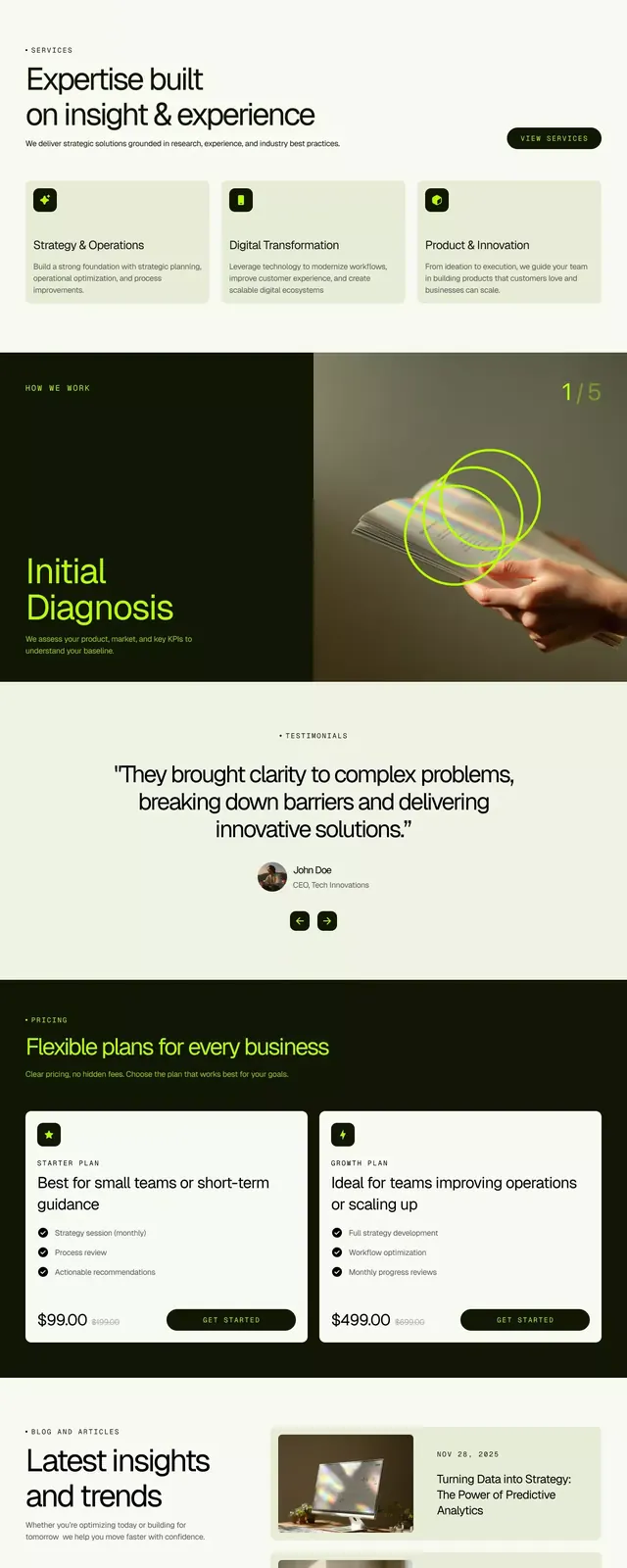
Full-page landing showing stacked sections alternating between imagery, cards, and testimonials on a cream background anchored by dark olive-green accents and typography.
Summary
B2B consulting landing page structured as vertically stacked sections: hero with portrait, multi-card feature grid, testimonial block, footer, all unified by dark olive-green and cream color system.
Visual description
Hero section: cream background with dark olive-green text headline, portrait photograph of person on left. Feature cards section: grid of 3-4 cards with dark backgrounds, light text, and icons, each describing a service offering. Testimonial block: white cards on cream, dark text, minimal layout emphasizing quotes. Footer/CTA section: cream and olive arrangement with final pitch and contact details. Typography throughout is clean sans-serif, left-aligned or centered as appropriate. Color palette limited to cream (#F8F9F4), dark olive (#2E3B22), near-black (#111606), muted beige (#E0E1D2), and accent green (#CAD3AD). Vertical rhythm created by consistent spacing and alternating background colors. Photographic elements (portrait) maintain professional, business-appropriate tone.
Key takeaway
The olive-and-cream palette creates high legibility while avoiding stark black-and-white. Dark olive acts as an anchor, appearing in text, cards, and accents, creating coherence across disparate sections. Ample white space between sections prevents overwhelm in a long-form layout. The feature cards use dark backgrounds for emphasis, contrasting smartly against the light page background. The portrait photography lends human credibility to the otherwise abstract business pitch.
Reuse notes
Strong template for B2B consulting, strategy, or professional services landing pages. The olive-green palette reads as sophisticated and grounded, appealing to corporate decision-makers. Pair with concise copy, clear CTAs, and testimonials to build trust. Works best when the testimonial section includes a real photograph. Avoid overloading with too many card types; the rhythm here succeeds through simplicity and repetition.
More like this



Keep what you find
A free account saves references to boards and can send you a weekly email of picks based on what you save.
To see every result, go Pro.